Suddenly Summer in Richmond Park

Tour de Richmond Park Leaderboard – year to date 2018

Screen Shot 2018-04-20 at 14.54.42

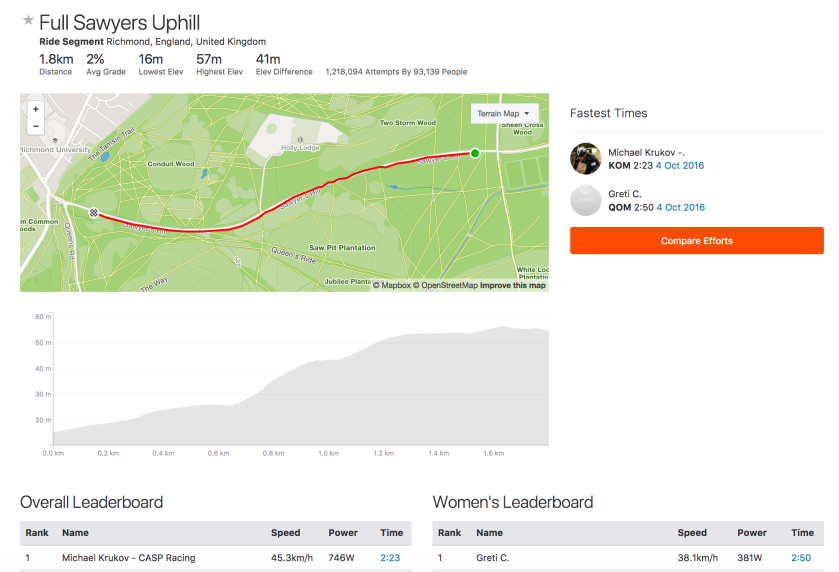
This week’s dramatic change in the weather has seen a string of quick laps recorded for the Tour de Richmond Park. Twelve out of the fastest fifteen efforts were completed on 18/19 April. Apart from the sheer pleasure of finally being able to ride in short sleeves, two meteorological factors came into play: higher temperatures and a favourable wind direction.

As noted in an earlier blog, changes in temperature have a far greater impact on air density than variations in atmospheric pressure and humidity. When I completed a lap last week, the temperature was 6oC, but on 19 April it was closer to 26oC. The warmer weather had the effect of reducing air density by more than 7%. Theoretically, this should allow you to ride about 2% faster for the same effort. Using a physics model I built last year to analyse Strava segments, it is possible to estimate the effect of variations in the factors that determine your position on the leaderboard. Based on an average power of 300W and some reasonable estimates of other variables, this rise in temperature would reduce your time from 16:25 to 16:04 (as expected, 2% quicker).

The other key factor is the wind. On 18/19 April, it was blowing from the south or southeast. This was not the mythical easterly that provides a tailwind up Sawyers Hill, but according to the analysis in another earlier blog, it is generally beneficial for doing a quick lap around the park.

I clocked up a decent time this morning, to reach 15th place on the year-to-date leaderboard, but I failed to take my own advice on the best time of day. The traffic tends to be lighter first thing in the morning or in the evening, when the park closes. After waiting until mid-morning for the temperature to rise, I ended up being blocked by slow-moving vehicles on two occasions.

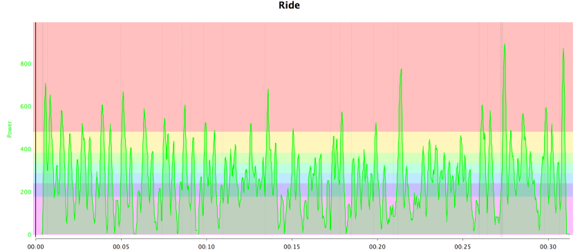
Although it was frustrating having to brake for traffic, the really puzzling thing was an average power reading of 254W. This is much lower than the other riders on the leaderboard. Last week, I did a lap in 16:44 at an average power of 313W, which seems much more reasonable. Admittedly, I was wearing a skin suit today, but that would not have saved 50W. It is possible that I had some drafting benefit from the numerous cars in the park and some favourable gusts of wind. However, my suspicion is that my Garmin Vector pedals had not calibrated correctly, after I switched them from my road bike, before today’s ride.

The concluding message is get on your bike and enjoy the sunshine. And why not try to beat your best time for the Tour de Richmond Park?


Which team is that?

Screen Shot 2018-04-11 at 11.18.09

My last blog explored the effectiveness of deep learning in spotting the difference between Vincenzo Nibali and Alejandro Valverde. Since the faces of the riders were obscured in many of the photos, it is likely that the neural network was basing its evaluations largely on the colours of their team kit. A natural next challenge is to identify a rider’s team from a photograph. This task parallels the approach to the kaggle dog breed competition used in lesson 2 of the fast.ai course on deep learning.

Eighteen World Tour teams are competing this year. So the first step was to trawl the Internet for images, ideally of riders in this year’s kit. As before, I used an automated downloader, but this posed a number of problems. For example, searching for “Astana” brings up photographs of the capital of Kazakhstan. So I narrowed things down by searching for  “Astana 2018 cycling team”. After eliminating very small images, I ended up with a total of about 9,700 images, but these still included a certain amount of junk that I did have the time to weed out, such as photos of footballers or motorcycles in the “Sky Racing Team”,.

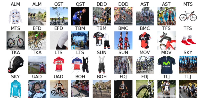
The following small sample of training images is generally OK, though it includes images of Scott bikes rather than Mitchelton-Scott riders and  a picture of  Sunweb’s Wilco Kelderman labelled as FDJ. However, with around 500-700 images of each team, I pressed on, noting that, for some reason, there were only 166 of Moviestar and these included the old style kit.

Screen Shot 2018-04-11 at 10.18.54.png
Small sample of training images

For training on this multiple classification problem, I adopted a slightly more sophisticated approach than before. Taking a pre-trained Resnet50 model, I performed some initial fine-tuning, on images rescaled to 224×224. I settled on an optimal learning rate of 1e-3 for the final layer, while allowing some training of lower layers at much lower rates. With a view to improving generalisation, I opted to augment the training set with random changes, such as small shifts in four directions, zooming in up to 10%, adjusting lighting and left-right flips. After initial training, accuracy was 52.6% on the validation set. This was encouraging, given that random guesses would have achieved a rate of 1 in 18 or 5.6%.

Taking a pro tip from fast.ai, training proceeded with the images at a higher resolution of 299×299. The idea is to prevent overfitting during the early stages, but to improve the model later on by providing more data for each image. This raised the accuracy to 58.3% on the validation set. This figure was obtained using a trick called “test time augmentation”, where each final prediction is based on the average prediction of five different “augmented” versions of the image in question.

Given the noisy nature of some of the images used for training, I was pleased with this result, but the acid test was to evaluate performance on unseen images. So I created a test set of two images of a lead rider from each squad and asked the model to identify the team. These are the results.

75 percent right.png
75% accuracy on the test set

The trained Resnet50 correctly identified the teams of 27 out of 36 images. Interestingly, there were no predictions of MovieStar or Sky. This could be partly due to the underrepresentation of MovieStar in the training set. Froome was mistaken for AG2R and Astana, in column 7, rows 2 and 3. In the first image, his 2018 Sky kit was quite similar to Bardet’s to the left and in the second image the sky did appear to be Astana blue! It is not entirely obvious why Nibali was mistaken for Sunweb and Astana, in the top and bottom rows. However, the huge majority of predictions were correct. An overall  success rate of 75% based on an afternoon’s work was pretty amazing.

The results could certainly be improved by cleaning up the training data, but this raises an intriguing question about the efficacy of artificial intelligence. Taking a step back, I used Bing’s algorithms to find images of cycling teams in order to train an algorithm to identify cycling teams. In effect, I was training my network to reverse-engineer Bing’s search algorithm, rather than my actual objective of identifying cycling teams. If an Internet search for FDJ pulls up an image of Wilco Kelderman, my network would be inclined to suggest that he rides for the French team.

In conclusion, for this particular approach to reach or exceed human performance, expert human input is required to provide a reliable training set. This is why this experiment achieved 75%, whereas the top submissions on the dog breeds leaderboard show near perfect performance.

Valverde or Nibali?

Alejandro Valverde has kicked off the 2018 season with an impressive series of wins. Meanwhile Vincenzo Nibali delighted the tifosi with his victory in Milan San Remo. It is pretty easy to tell these two riders apart in the pictures above, but could computer distinguish between them?

Following up on my earlier blogs about neural networks, I have been taking a look at the updated version of fast.ai’s course on deep learning. With the field advancing at a rapid pace, this provides a good way to staying up to date with the state of the art. For example, there are now a couple of cheaper alternatives to AWS for accessing high powered GPUs, offered by Paperspace and Crestle. The latest fast.ai libraries include many new tools that work extremely well in practice.

There’s a view that deep learning requires hours of training on high-powered supercomputers, using thousands (or millions) of labelled examples, in order to learn to perform computer vision tasks. However, newer architectures, such as ResNet, are able to run on much smaller data sets. In order to test this, I used an image downloader to grab photos of Nibali and Valverde and manually selected about 55 decent pictures of each one.

I divided the images into a training set with about 40 images of each rider, a validation set with 10 of each and a test set containing the rest. Nibali appears in a range of different coloured jerseys, though the Astana blue is often present. Valverde is mainly wearing the old dark blue Movistar kit with a green M. There were more close-up shots of Nibali’s face than Valverde.

Screen Shot 2018-04-03 at 18.30.08.png

I was able to fine-tune a pre-trained ResNet neural network to this task, using some of the techniques from the fast.ai tool box, each designed to improve generalisation. The first trick was to augment the training set by performing minor transformations of the images at random, such as taking a mirror image, shifting left or right and zooming in a bit. The second set of tricks varied the rate of learning as the algorithm iterated repeatedly through the training set. A final useful technique created a set of variants of each test image and took the average of the predictions. Everything ran at lightning speed on a Paperspace GPU. After a run time of just a few minutes, the ResNet was able to  score 17 out of 20 on the following validation set.

Screen Shot 2018-04-03 at 18.49.27.png

The confusion matrix shows that the model correctly identified all the Nibali images, but it was wrong on three pictures of Valverde. The first incorrect image (below) shows Valverde in the red leader’s jersey of the Tour of Murcia, which is not dissimilar to Nibali’s new Bahrain Merida kit, though he was wearing red in two of his training images. In the second instance, the network was fooled by the change in colour of Moviestar’s kit, which had become rather similar to Astana’s light blue. The figure of 0.41 above the close-up image indicates that the model assigned only a 41% probability that the image was Valverde. It probably fell below the critical 50% level, in spite of the blue/green colours, because there were were far more close-up shots of Nibali than Valverde in the training set.

Overall of 17 out of 20 on the validation set is impressive. However, the network had access to the validation set during training, so this result is “in sample”. A proper  “out of sample” evaluation of the model’s ability made use the following ten images, comprising the test set that was kept aside.

Screen Shot 2018-04-03 at 21.21.59

Amazingly, the model correctly identified 9 out of the 10 pictures it had not seen before. The only error was the Valverde selfie shown in the final image. In order to work better in practice, the training set would need to include more examples of the riders’ 2018 kit. A variant of the problem would be to identify the team rather than the rider. The same network can be trained for multiple classes rather than just two.

This experiment shows that it is pretty straightforward to run state of the art image recognition tools remotely on a GPU somewhere in the cloud and come up with pretty impressive results, even with a small data set.

The next blog describes how to identify a rider’s team.


Froome’s data on Strava

Screen Shot 2018-01-29 at 14.59.39

Chris Froome has been logging data on Strava since the beginning of the year. He had already completed over 4,500km, around Johannesburg, in the first four weeks of January. The weather has been hot and he has been based at an altitude of around 1350m. Some have speculated that he has been replicating the conditions of a grand tour, so that measurements can be made that may assist in his defence against the adverse analytical finding made at last year’s Vuelta.

Whatever the reasons, Froome chose to “Empty the tank” with epic ride on 28 January, completing 271km in just over six hours at an average of 44.8kph. The activity was flagged on Strava, presumably because he completed it suspiciously fast. For example, he rode the 20km Back Straight segment at 50.9kph, finishing in 24:24, nearly four minutes faster than holder of the the KOM: a certain Chris Froome. Since there was no significant wind blowing, one can only assume he was being motor-paced.

One interesting thing about rides displayed publicly on Strava is that anyone can download a GPX file of the route, which shows the latitude, longitude and altitude of the rider, typically at one second intervals. Although Froome is one of the professional riders who prefer to keep their power data private, this blog explores the possibility of estimating power from the  GPX file. The plan is similar to the way Strava estimates power.

  1. Calculate the rider’s speed from changes in position
  2. Calculate the gradient of the road from changes in altitude
  3. Estimate air density from historic weather reports
  4. Make assumptions about rider/bike mass, aerodynamic drag, rolling resistance
  5. Estimate power required to ride at estimated speed

Knowledge is power

FroomeyTT

An interesting case study is Froome’s TT Bike Squeeeeze from 6 January, which included a sustained 2 hour TT effort. Deriving speed and gradient from the GPX file is straightforward, though it is helpful to include smoothing (say, a five second average) to iron out noise in the recording. It is simple to check the average speed and charts against those displayed on Strava.

Several factors affect air density. Firstly, we can obtain the local weather conditions from sources, such as Weather Underground. Froome set off at 6:36am, when it was still relatively cool, but he Garmin shows that it warmed up from 18 degrees to 40 degrees during the ride. Taking the average of 29 for the whole ride simplifies matters. Air pressure remained constant at around 1018hPa, but this is always quoted for sea level, so the figure needs to be adjusted for altitude. Froome’s GPS recorded an altitude range from 1242m to 1581m. However we can see that his starting altitude was recorded as 1305m, when the actual altitude of this location was 1380m. We conclude that his average altitude for the ride, recorded at 1436m, needs to be corrected by 75m to 1511m and opt to use this as an elevation adjustment for the whole ride. This is important because the air is sufficiently less dense at this altitude to have a noticeable impact on aerodynamic drag.

An estimate of power requires some additional assumptions. Froome uses his road bike, TT bike and mountain bike for training, sometimes all in the same ride, and we suspect some rides are motor-paced. However, he indicates that the 6 January ride was on the TT bike. So a CdA of 0.22 for drag and a Crr of 0.005 for rolling resistance seem reasonable. Froome weighs about 70kg and fair assumptions were taken for the spec of his bike. Finally, the wind was very light, so it was ignored in the calculations.

Screen Shot 2018-01-29 at 14.32.39

Under these assumptions, Froome’s estimated average power was 205W. The red shaded area marks a 2 hour effort completed at 43.7kph, with a higher average power of 271W. His maximal average power sustained over one hour was 321W or 4.58W/kg. There is nothing adverse about these figures; they seem to be eminently within the expected capabilities of the multiple grand tour winner.

Of course, quite a few assumptions went into these calculations, so it is worth identifying the most important ones. The variation of temperature had a small effect: the whole ride at 18 degrees would have required an average of 209W or, at 40 degrees, 201W. Taking account of altitude was important: the same ride at sea level would have required 230W, but the variations in altitude during the ride were not significant. At the speeds Froome was riding, aerodynamics were important: a CdA of 0.25 would have needed 221W, whereas a super-aero CdA of 0.20 rider could have done 195W. This sensitivity analysis suggests that the approach is robust.

Running the same analysis over the “Empty the tank” ride gives an average power requirement of 373W for six hours, which is obviously suspect. However, if he was benefiting from a 50% reduction in drag by following a motor vehicle, his estimated average power for the ride would have been 244W – still pretty high, but believable.

Posting rides on Strava provides an independently verifiable adjunct to a biological passport.

Cycling Data Science – building models


Screen Shot 2017-12-24 at 21.19.31.pngIn the previous blog, I explored the structure of a data set of summary statistics from over 800 rides recorded on my Garmin device. The K-means algorithm was an example of unsupervised learning that identified clusters of similar observations without using any identifying labels. The Orange software, used previously, makes it extremely easy to compare a number of simple models that map a ride’s statistics to its type: race, turbo trainer or just a training ride. Here we consider Decision Trees, Random Forests and Support Vector Machines.

Decision Trees

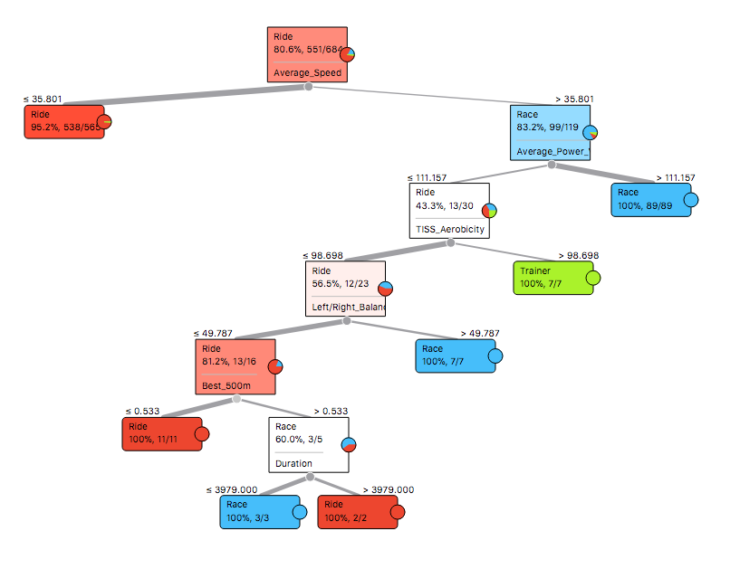
Perhaps the most basic approach is to build a Decision Tree. The algorithm finds an efficient way to make a series of binary splits of the data set, in order to arrive at a set of criteria that separates the classes, as illustrated below.

Tree
Decision Tree

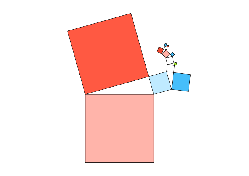
The first split separates the majority of training rides from races and turbo trainer sessions, based on an average speed of 35.8km/h. Then Average Power Variance helped identify races, as observed in the previous blog. After this, turbo trainer sessions seemed to have a high level of TISS Aerobicity, which relates to the percentage of effort done aerobically. Pedalling balance, fastest 500m and duration separated the remaining rides. An attractive way to display these decisions is to create a Pythagorean Tree, where the sides of each triangle relate to the number of observations split by each decision.

Screen Shot 2017-12-24 at 16.32.02
Pythagorean Tree

Random Forests

Many alternative sets of decisions could separate the data, where any particular tree can be quite sensitive to specific observations. A Random Forest addresses this issue by creating a collection of different decision trees and choosing the class by majority vote. This is the Pythagorean Forest representation of 16 trees, each with six branches.

Pythagorean1
Pythagorean Forest

Support Vector Machines

A Support Vector Machine (SVM) is a widely used model for solving this kind of categorisation problem. The training algorithm finds an efficient way to slice the data, that largely separates the categories, while allowing for some overlap. The points that are closest to the slices are called support vectors. It is tricky to display the results in such a high dimensional space, but the following scatter plot displays Average Power Variance versus Average Speed, where the support vectors are shown as filled circles.

SVM
Support Vectors shown as filled circles

Comparison of results

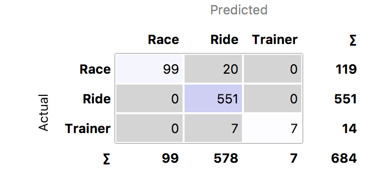
A Confusion Matrix provides a convenient way to compare the accuracy of the models. This correlates the predictions versus the actual category labels. Out of the 809 rides, only 684 were labelled. The Decision Tree incorrectly labelled 20 races and 7 turbos as training rides. The Random Forest did the best job, with only six misclassifications, while the SVM made 11 errors.

Looking at the classification errors can be very informative. It turns out that the two training rides classified as races by the SVM had been accidentally mislabelled – they were in fact races! Furthermore, looking at the five races the that SVM classified as training rides, I punctured in one, I crashed in another and in a third race, I was dropped from the lead group, but eventually rolled in a long way behind with a grupetto. The Random Forest also found an alpine race where my Garmin battery failed and classified it as a training ride. So the misclassifications were largely understandable.

After correcting the data set for mislabelled rides, the Random Forest improved to just two errors and the SVM dropped to just eight errors. The Decision Tree deteriorated to 37 errors, though it did recognise that the climbing rate tends to be zero on a turbo training session.

Prediction

Having trained three models, we can take a look at the sample of 125 unlabelled rides. The following chart shows the predictions of the Random Forest model. It correctly identified one race and suggested several turbo trainer sessions. The SVM also found another race.

asapv
Random Forest predictions of unlabelled rides

Conclusions

Several lessons can be learned from these experiments. Firstly, it is very helpful to start with a clean data set. But if this is not the case, looking at the misclassified results of a decent model can be useful in catching mislabelled data. The SVM seemed to be good for this task, as it had more flexibility to fit the data than the Decision Tree, but it was less prone to overfit the data than the Random Forest.

The Decision Tree was helpful in quickly identifying average speed and power variance (chart below) as the two key variables. The SVM and Random Forest were both pretty good, but less transparent. One might improve on the results by combining these two models.

apv
Distribution of APV (large peak at zero is where no power was recorded for ride)

The next blog will explore this topic further.


Cycling Data Science – clusters

Screen Shot 2017-12-11 at 13.38.30

Data Science is a hot topic that is impacting a range of diverse areas from business to sport. With so many cyclists collecting and uploading their data, there is plenty of raw material from which to draw interesting insights. This is the first in a series of articles exploring applications of data science in the field of cycling, beginning with the concept of clustering.

As a data set, I took all my Garmin files covering 2014-2017. Having previously uploaded them onto Golden Cheetah (GC), I took advantage of the API that allows external programmes, such as Python, to retrieve data. I also used a Python library to download the same rides from Strava, where I had recorded additional information about the rides.
After a certain amount of (rather time-consuming) tidying up, I ended up with over 800 rides. Each ride had over 200 summary statistics calculated by GC, as well as other meta-data, such as whether the ride was a race or turbo session. The metrics included all the standard items, such as time, distance, speed, heart rate, power, elevation gain, TSS, normalised power, as well as more esoteric metrics like “Time expended when Power is above CP and W’ bal is between 50% and 75% of W'”. When each ride is represented by a point in 200-dimensional space, it is easy to be overwhelmed. As a coach or an informed rider, which metrics are the most meaningful? This is precisely where data science steps in.
I decided to use some open source machine learning and data visualisation software called Orange. This makes it very straightforward to set up simple pipelines using a toolbox of standard approaches, as illustrated above.
One of the first things to do was to ask the computer to look for clusters of rides with similar characteristics. Orange has a useful feature that finds informative projections of the data that can be displayed on a scatter plot. As a first cut, the K-means algorithm categorised the data into four clusters that were largely explained by the time of day and the duration of the ride.
Screen Shot 2017-12-11 at 16.34.22
Duration of ride (in seconds) versus Time of day (seconds since midnight)

Although this makes a pretty graph, it simply tells us that I start a lot of rides in the morning, but do quite a few in the afternoon and evening. The green cluster includes my longer rides that rather obviously have to start earlier in the day. The scale is annoyingly shown in seconds, so a duration of 1800 would be a five hour ride. The blue band runs from about 1:30pm to about 6:30pm.

Grouping rides by time of day was not very helpful, so I filtered out that variable and searched again for rides that were similar in terms of effort. This made the results much more interesting. Distance and Average Power Variance (APV) were among the most informative metrics. The following scatter plot does a very good job of separating out races (shown in green), from normal rides and turbo trainer sessions (red). The points I did not have time to label are shown in grey.
Screen Shot 2017-12-12 at 19.33.40
Average Power Variance measures the mean power deviation with respect to its 30 second moving average. This will be high when power output is continually changing sharply, as it does on very short town centre courses or the Crystal Palace loop, where you are repeatedly sprinting out of corners. When racing on the Hillingdon and Dunsfold circuits or longer Surrey League routes, power is still much more variable than on a club ride. The band of Saturday club riders is very obvious at 53km: four laps of Richmond Park, with varying levels of APV depending on how aggressively the group was riding. You can also see that I quite often do only one or two laps, at about 19km and 30km. Short TTs and hill climb races tend to have less power variability. This was also the case on the endlessly long climbs encountered on the Haute Route. Lastly, turbo sessions have much lower APV because, even if target power levels vary, they tend to be sustained at the same level for each segment.
It is worth noting that APV is not correlated with the Variability Index, which is the ratio of normalised power to average power. APV is affected by continual changes in power output, whereas the Variability Index is strongly affected by power peaks, even if they a relatively few. The two power files below illustrate the difference.
Screen Shot 2017-12-11 at 17.39.55
Crit race: High APV Low VI
Screen Shot 2017-12-11 at 17.39.02
Three sprints: Low APV High VI

Conclusions

This analysis draws attention to Average Power Variance as a useful metric that is high for circuit and road races, but lower for TTs and long hilly races. The key observation for me is that relatively little of my training has a high APV.

The next part in this series zooms in on the races, to identify metrics associated with good and bad results.

Kings and Queens of the Mountains

Screen Shot 2017-11-09 at 18.40.09.png

I guess that most male cyclists don’t pay much attention to the women’s leaderboards on Strava. And if they do it might just be to make some puerile remark about boys being better than girls. From a scientific perspective the comparison of male and female times leads to some interesting analysis.

Assuming both men and women have read my previous blogs on choosing the best time, weather conditions and wind directions for the segment that suits their particular strengths, we come back to basic physics.

KOM or QOM time = Work done / Power = (Work against gravity + Drag x Distance + Rolling resistance x Distance) / (Mass x Watt/kg)

Of the three components of work done, rolling resistance tends to be relatively insignificant. On a very steep hill, most of the work is done against gravity, whereas on a flat course, aerodynamic drag dominates.

The two key factors that vary between men and women are mass and power to weight ratio (watts per kilo).  A survey published by the ONS in 2010, rather shockingly reported that the average British man weighed 83.6kg, with women coming in at 70.2kg. This gives a male/female ratio of 1.19. KOM/QOM cyclists would tend to be lighter than this, but if we take 72kg and 60kg, the ratio is still 1.20.

Males generate more watts per kilogram due to having a higher proportion of lean muscle mass. Although power depends on many factors, including lungs, heart and efficiency of circulation, we can estimate the relative power to weight ratio by comparing the typical body composition of males and females. Feeding the ONS statistics into the Boer formula gives a lean body mass of 74% for men and 65% for women, resulting in a ratio of 1.13. This can be compared against the the useful table on Training Peaks showing maximal power output in Watts/kg, for men and women, over different time periods and a range of athletic abilities. The table is based on the rows showing world record performances and average untrained efforts.  For world champion five minute efforts and functional threshold powers, the ratios are consistent with the lean mass ratio. It makes sense that the ratio should be higher for shorter efforts, where the male champions are likely to be highly muscular. Apparently the relative performance is precisely 1.21 for all durations in untrained people.

Screen Shot 2017-11-08 at 10.23.33

On a steep climb, where the work done against gravity dominates, the benefit of additional male muscle mass is cancelled by the fact that this mass must be lifted, so the difference in time between the KOM and the QOM is primarily due to relative power to weight ratio. However, being smaller, women suffer from the disadvantage that the inert mass of bike represents a larger proportion of the total mass that must be raised against gravity. This effect increases with gradient. Accounting for a time difference of up to 16% on the steepest of hills.

In contrast, on a flat segment, it comes down to raw power output, so men benefit from advantages in both mass and power to weight ratio. But power relates to the cube of the velocity, so the elapsed time scales inversely with the cube root of power. Furthermore, with smaller frames, women present a lower frontal area, providing a small additional advantage. So men can be expected to have a smaller time advantage of around 9%. In theory the advantage should continue to narrow as the gradient shifts downhill.

Theory versus practice

Strava publishes the KOM and QOM leaderboards for all segments, so it was relatively straightforward to check the basic model against a random selection of 1,000 segments across the UK. All  leaderboards included at least 1,666 riders, with an overall average of 637 women and 5,030 men. One of the problems with the leaderboards is that they can be contaminated by spurious data, including unrealistic speeds or times set by groups riding together. To combat this, the average was taken of the top five times set on different dates, rather than simply to top KOM or QOM time.

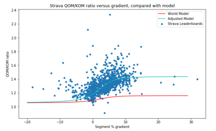
The average segment length was just under 2km, up a gradient of 3%. The following chart plots the ratio of the QOM time to the KOM time versus gradient compared with the model described above. The red line is based on the lean body mass/world record holders estimate of 1.13, whereas the average QOM/KOM ratio was 1.32. Although there is a perceivable upward slope in the data for positive gradients, clearly this does not fit the data.
Screen Shot 2017-11-09 at 17.54.43

Firstly, the points on the left hand side indicate that men go downhill much more fearlessly than women, suggesting a psychological explanation for the observations deviating from the model. To make the model fit better for positive gradients, there is no obvious reason to expect the weight ratio of male to female Strava riders to deviate from the general population, so this leaves only the relative power to weight ratio. According to the model the QOM/KOM ratio should level off to the power to weight ratio for steep gradients. This seems to occur for a value of around 1.40, which is much higher than the previous estimates of 1.13 or the 1.21 for untrained people. How can we explain this?

A notable feature of the data set was that sample of 1,000 Strava segments was completed by nearly eight times as many men as women. This, in turn reflects the facts that there are more male than female cyclists in the UK and that men are more likely to upload, analyse, publicise and gloat over their performances than women.

Having more men than women, inevitably means that the sample includes more high level male cyclists than equivalent female cyclists. So we are not comparing like with like. Referring back to the Training Peaks table of expected power to weight ratios, a figure of 1.40 suggests we are comparing women of a certain level against men of a higher category, for example, “very good” women against “excellent” men.

A further consequence of having far more men than women is that is much more likely that the fastest times were recorded in the ideal conditions described in my previous blogs listed earlier.

Conclusions

There is room for more women to enjoy cycling and this will push up the standard of performance of the average amateur rider. This would enhance the sport in the same way that the industry has benefited as more women have joined the workforce.

Froome versus Dumoulin

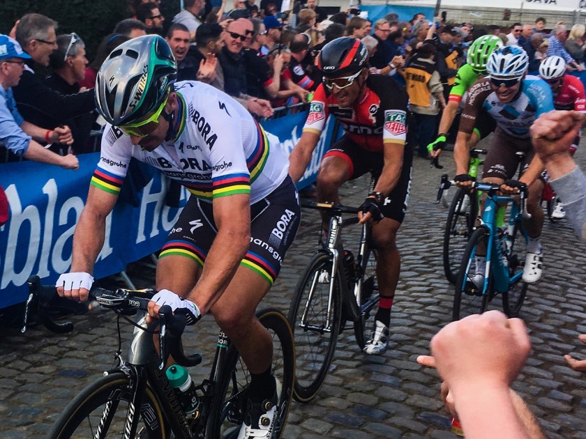
Screen Shot 2017-10-27 at 19.04.21Many commentators have been licking their lips at the prospect of head-to-head combat between Chris Froome and Tom Dumoulin at next year’s Tour de France. It is hard to make a comparison based on their results in 2017, because they managed to avoid racing each other over the entire season of UCI World Tour races, meeting only in the World Championship Individual Time Trial, where the Dutchman was victorious. But it is intriguing to ask how Dumoulin might have done in the Tour de France and the Vuelta or, indeed, how Froome might have fared in the Giro.
Inspiration for addressing these hypothetical questions comes from an unexpected source. In 2009 Netflix awarded a $1million prize to a team that improved the company’s technique for making film recommendations to its users, based on the star ratings assigned by viewers. The successful algorithm exploited the fact that viewers may enjoy the films that are highly rated by other users who have generally agreed on the ratings of the films they have seen in common. Initial approaches sought to classify films into genres or those starring particular actors, in the hope of grouping together viewers into similar categories. However, it turned out to be very difficult to identify which features of a film are important. An alternative is simply to let the computer crunch the data and identify  the key features for itself. A method called Collaborative Filtering became one of the most popular employed for recommender systems.

Our cycling problem shares certain characteristics with the Netflix challenge: instead of users, films and ratings, we have riders, races and results. Riders enter a selection of races over the season, preferring those where they hope to do well. Similar riders, for example sprinters, tend to finish high in the results of races where other sprinters also do well. Collaborative filtering should be able to exploit the fact that climbers, sprinters or TTers tend to finish close to each other, across a range of races.

This year’s UCI World Tour concluded with the Tour of Guangxi, completing the data set of results for 2017. After excluding team time trials, 883 riders entered 174 races, resulting in 26,966 finishers. Most races have up to 200 participants , so if you imagine a huge table with all the racers down the rows and all the races across the columns, the resulting matrix is “sparse” in the sense that there are lots of missing values for the riders who were not in a particular race. Collaborative Filtering aims to fill in the spaces, i.e. to estimate the position of a rider who did not enter a specific race. This is exactly what we would like to do for the Grand Tours.

It took a couple of minutes to fit a matrix factorisation Collaborative Filtering model, using keras, on my MacBook Pro. Some experimenting suggested that I needed about 50 hidden factors plus a bias to come up with a reasonable fit for this data set. Taking at random the Milan San Remo one day stage race, it did a fairly good job of predicting the top ten riders for this long, hilly race with a flat finish.

 Model fit (prediction) Rider Actual result
1 Peter_Sagan 2
2 Alexander_Kristoff 4
3 Michael_Matthews 12
4 Edvald_Boasson_Hagen 19
5 Sonny_Colbrelli 13
6 Michal_Kwiatkowski 1
7 John_Degenkolb 7
8 nacer_Bouhanni 8
9 Julian_Alaphilippe 3
10 Diego_Ulissi 40

The following figure visualises the primary factors the model derived for classifying the best riders. Sprinters are in the lower part of chart, with climbers towards the top and allrounders in the middle. Those with a lot of wins are towards the left.

Screen Shot 2017-10-27 at 19.26.17

Now we come to the interesting part: how would Tom Dumoulin and Chris Froome have compared in the other’s Grand Tours? Note that this model takes account of the results of all the riders in all the races, so it should be capable of detecting the benefit of being part of a strong team.

Tour de France

The model suggested that Tom Dumoulin would have beaten Chris Froome in stages 1(TT), 2, 5, 6, 10 and 21, but the yellow jersey winner would have been stronger in the mountains and won overall.

Giro d’Italia

The model suggested that Chris Froome would have been ahead in the majority of stages, leaving stages 4, 5, 6, 9,  10(TT), 14 and 21(TT) to Dumoulin. The Brit would have most likely claimed the pink jersey.

Vuelta a España

The model suggested that Tom Dumoulin would have beaten Chris Froome in stages 2, 4, 12, 18, 19 and 21. In spite of a surge by the Dutchman towards the end of the race, the red jersey would have remained with Froome.

Conclusions

Based on a Collaborative Filtering approach, the results of 2017 suggest that Chris Froome would have beaten Tom Dumoulin in any of the Grand Tours.

Ranking Top Pro Cyclists for 2017

peter-sagan.jpg

Following Il Lombardia last weekend, the World Tour has only two more events this year. It is time to ask who were the best sprinters of 2017? Who was the best climber or puncheur? The simplest approach is to count up the number of wins, but this ignores the achievement of finishing consistently among the top riders on different types of parcours. This article explores ways of creating rankings for different types of riders.

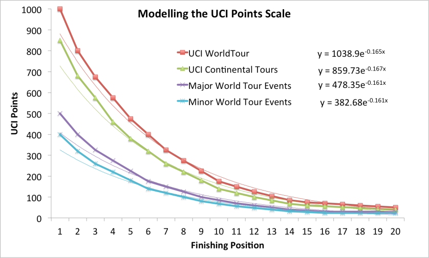
The current UCI points system, introduced in 2016, is fiendishly complicated, with points awarded for winning races and bonuses given to those wearing certain jerseys in stage races. The approach applies different scales according to the type of event, but each of these scales puts a premium on winning the race, with points awarded for first place being just over double the reward of the fifth-placed rider. In fact, taking the top 20 places in the four main world tour categories of event, the curve of best fit is exponential with a coefficient of approximately -1/6. In other words, there’s a linear relationship between a rider’s finishing position and the logarithm of the UCI points awarded.

UCI Points

This observation is really useful, because it provides a straightforward way of assessing the performance in different types of races, based on their finishing positions. The  PCS web site is great source of  professional cycling statistics. One nice feature is that most of the races/stages have an associated profile indicated by a little logo, see Tour de France. These classify races into the following categories:

  • Flat e.g. TdF stage 2 from Düsseldorf to Liège
  • Hills with a flat finish e.g. Milan San Remo
  • Hills with an uphill finish e.g. Fleche Wallonne
  • Mountains with a flat finish e.g. TdF stage 8 Station des Rousses
  • Mountains with an uphill finish e.g. TdF stage 5 La Planche des Belles Filles
  • It is also reasonable to assume that any stage of less than 80km was a TT

We would expect outright sprinters to top the rankings in flat races, whereas the puncheurs come to the fore when it becomes hilly, with certain riders doing particularly well on steep uphill finishes. The climbers come into their own in the mountains, with some being especially strong on summit finishes.

Taking the results of all the World Tour races in 2017 completed up to Il Lobardia and applying the simple -1/6 exponential formula equally to all categories of event,  we obtain the following “derived ranking”,  arranged by the profile of event.

Derived ranking for 2017 World Tour events, according to parcours

Screen Shot 2017-10-10 at 20.02.24

Marcel Kittel rightly tops the sprinters on flat courses (while Cavendish was 11th), but the Katusha Alpecin rider and several others have tended to be dropped on hilly courses, where Sagan, Ewan and Kristoff were joined by Trentin, Gaviria and some classic puncheurs. Sagan managed to win some notable uphill finishes, such as Tirreno-Adriatico and Grand Prix Cycliste de Quebec, alongside riders noted for being strong in the hills. The aggression of Valverde and Contador put them ahead of Froome on mountain stages that finished on the flat, but the TdF winner, Zakarin and Bardet topped the rankings of pure climbers for consistency on summit finishes. Finally we see the usual suspects topping the TT rankings.

It should be noted that ranking performances based simply on positions, without some form of scaling, gave very unintuitive results. While simpler than the UCI points system, this analysis supports the idea of awarding points in a way that scales exponentially with the finishing position of a rider.


Deep Learning – Faking It

Screen Shot 2017-08-20 at 15.01.01
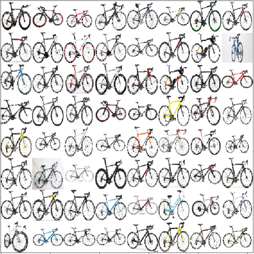
Thumbnails of real bikes (Bianchi, Giant, Cube…)
Screen Shot 2017-08-20 at 15.01.15
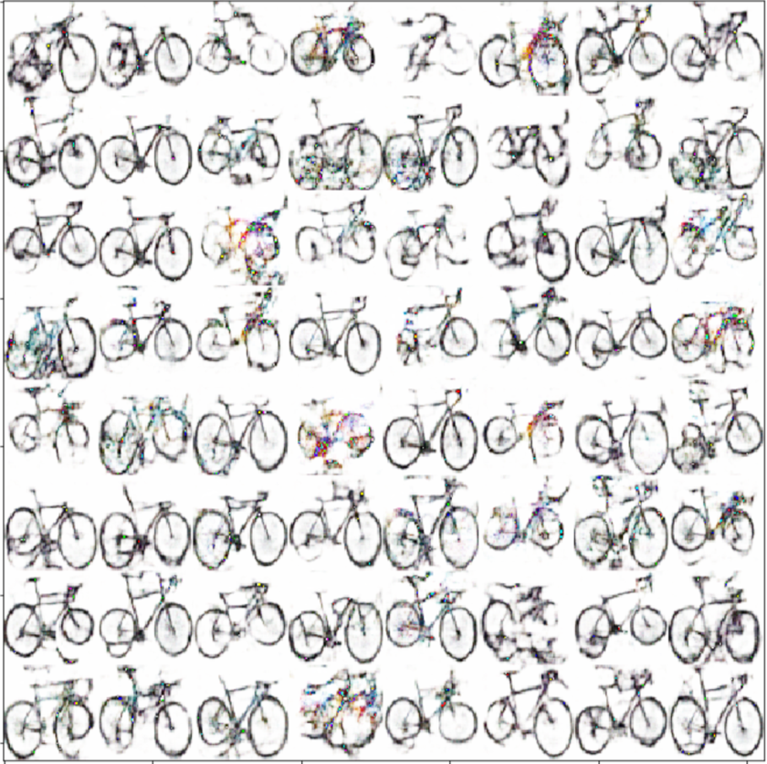
Fake thumbnails generated randomly by Wasserstein Generative Adversarial Network

My last blog showed the results of using a deep convolutional neural network to apply different artistic styles to a photograph of cyclist.  This article looks at the trendy topic of Generative Adversarial Networks (GANs). Specifically, I investigate the application of a Wasserstein GAN to generate thumbnail images of bicycles.

In the field of machine learning, a generative model is a model designed to produce examples from a particular target distribution. In statistics, the output might be samples from a Gaussian distribution, but we can extend the idea to create a model that produces examples of sonnets in the style of Shakespeare or pictures of cats… or bicycles.

The adversarial framework introduces an attractive idea from game theory: to create a competitive form of learning. While a generator learns from a corpus of real examples how to create realistic “fakes”, a discriminator (or critic) learns to distinguish been fakes and authentic examples. In fact, the generator is given the objective of trying to fool the discriminator. As the discriminator improves, the generator is driven to enhance the authenticity of its output. This creates a virtuous cycle.

When originally proposed in 2014, Generative Adversarial Networks stimulated much interest, but it proved hard to make them work reliably in practice. One problem was “mode collapse”, where the generator becomes stuck, producing the same output all the time. However, this changed with the publication of a recent paper, explaining how earlier problems could be overcome by using a so-called Wasserstein loss function.

As an experiment, I downloaded a batch of images of bicycles from the Internet. After manually removing pictures with riders and close-ups of components, there were about 1,200 side views of road bikes (mostly with handlebars to the right, so you can see the chainset). After a few experiments, I reduced the dataset to the 862 images, by automatically selecting bikes against a white background.

Screen Shot 2017-08-20 at 14.45.29
Sample of real bike images

As a participant of part 2 of the excellent fast.ai deep learning course, I made use of WGAN code that runs using Pytorch. I loaded the bike images at thumbnail size of 64×64 (training with larger images exceeded the memory constraints of the p2.large GPU I’m running on AWS). It was initially disappointing to experience the mode collapse problem, especially because the authors of the WGAN paper claimed never to have encountered it. However, speeding up the learning rate of the generator seemed to solve the problem.

Although each fake was created from a completely random starting point, the generator learned to produce images against a white background, with two circles joined by lines. After a couple of hundred iterations the WGAN began to generate some recognisably bicycle-like images. Notice the huge variety. Some of the best ones are shown at the top of this post.

Screen Shot 2017-08-20 at 14.41.19
Sample of images generated by WGAN

I tried to improve the WGAN’s images, using another deep learning tool: super resolution. This amazing technique is used to solve the seemingly impossible task of converting images from low resolution to high resolution. It is achieved by taking downgraded versions of a large dataset of high resolution images, then training a neural network to reproduce a high-res version from the corresponding low-res input. A super resolution network is able to learn about certain properties of the world, for example, it converts jagged curves into smooth ones – a feature I’d hoped might be useful for making wheels look rounder.

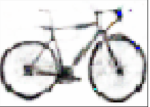
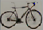
Example of a super resolution network on real photographs

Unfortunately, my super resolution experiments did not lead to the improvement I’d hoped for. Two possible explanations are that a) the fake images were not low-res photos and b) the network had been trained on many types of images other than bicycles with white backgrounds.

Example of super resolution network on a fake bicycle image

In the end I was pretty happy with the best of the 64×64 images shown above. They are at least as good as something I could draw by hand. This is an impressive example of unsupervised learning. The trained network is able to use some learned notion of what a bicycle looks like in order to produce new images that possess similar properties. With more time and training, I’m sure the WGAN could be improved, perhaps to the point where the images might provide creative inspiration for new bike designs.

References

Goodfellow, I. J., Pouget-Abadie, J., Mirza, M., Xu, B., Warde-Farley, D., Ozair, S., … Bengio, Y. (2014). Generative Adversarial Networks. 

Arjovsky, M., Chintala, S., & Bottou, L. (2017). Wasserstein GAN. 

Johnson, J., Alahi, A., & Fei-Fei, L. (2016). Perceptual Losses for Real-Time Style Transfer and Super-Resolution.