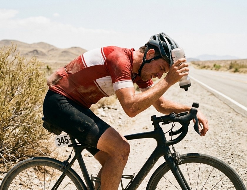
This article is the third in a three-part series about cycling in the heatwaves that are becoming ever more frequent as we experience climate change. Part 1 explored the physics of thermoregulation. Part 2 was about how the body copes when riding in high temperatures. This article covers physiological changes that occur after several days of heat exposure.
This article is the second in a three-part series about cycling in the heatwaves that are becoming ever more frequent as we experience climate change. Part 1 explored the physics of thermoregulation. This article is about how the body copes when riding in high temperatures. Part 3 covers physiological changes that occur after several days of heat exposure.
This article is the first in a three-part series about cycling in the heatwaves that are becoming ever more frequent as we experience climate change. We explore the physics of thermoregulation. Part 2 is about how the body copes when riding in high temperatures. Part 3 covers physiological changes that occur after several days of heat exposure.
Have we reached the stage where agentic AI gives you superpowers? We have moved on from chatbots to AI agents that can carry out tasks for you. The most powerful way to use an agentic AI is to Augment your Intelligence. I set myself a goal of completing a substantial project on a Saturday afternoon.
Even the free versions of AIs will do amazing things, but if you want to create something useful, you need to have a vision of what you’d like to achieve. A good starting place is to consider your own personal areas of expertise. I decided to use the 81 blogs on this web site as my subject matter. My vision was to generate the 3D semantic map that appears at the top of this page.
Make a plan
AI tools: I decided to use the Copilot agent in VSCode to perform web scraping, coding and data processing tasks. Gemini provided some useful pointers along the way. I also wanted to experiment with running a language model locally.
Data: Scrape all the blogs from my web site
Processing: Create a semantic representation of each blog in the form of an embedding. Reduce the dimensionality of the embeddings. Look for clusters. Identify common semantic characteristics of the members of each cluster.
Presentation: Turn it into a 3D plot, highlighting the clusters and the progression of time.
Scraping
I asked Copilot to create a uv python environment in VSCode. In order to scrape all my blogs, Copilot first found the sitemap.xlm and then I asked it to create a JSON file with the page name, date and text of each blog. After a little tidying up this was all done in about half an hour.
Semantic embeddings
I turned to Gemini for suggestions of the best publicly-available text embedding model on HuggingFace that would run on my MacBook Pro. It proposed a Qwen2-7B model due to its large context window and strong performance. I had already downloaded LM Studio, so it is was simple (or so I thought) to download the model and set it running on a local server. However, after numerous attempts, Copilot could not get a response from the server, even though LM Studio confirmed it was running. Eventually Gemini suggested that the Qwen2 model was running as a chatbot rather than an embedding domain. I eventually found the “Override Domain Type” in the LM Studio models tab. Once I switched it to Embedding, Bingo! Everything worked.
Copilot’s Python code successfully created text embeddings for all the blogs. My intuition was that blogs on similar topics would be closer to each other in embedding space, but the embedding dimension was 3584. Fortunately, along with recommending a text embedding model, Gemini had recommended using UMAP, as the gold standard in visualising complex data sets while preserving clusters, in preference to alternatives, such as Principal Components Analysis, and to use Plotly for visualisation.
Copilot wrote scripts to collapse the dimensions to three and to display the results in a 3D Plotly chart. This all ran perfectly. Upon inspection, I could see distinct groupings, so I asked Copilot to identify four clusters. It decided to use K-means, which was fine by me, but this unsupervised method doesn’t explain why the points in the same cluster were close to each other. So I went back to Copilot and instructed it to review to the original 3584 dimensional embeddings and identify, for each of the four clusters, what aspects of the text explain why the blogs have been grouped together?
Copilot chugged away for a while and came back with a very nice characterisation of each group. It is instructive to look at the code to find out how it did this. The code shifted back into the full embedding space and identified the five blogs closest to the centroid of each cluster. It appeared to use snippets of the first 220 characters of the top five blogs to identify the themes. I think this worked because each blog opens with a summary of the topic. Copilot produced the short labels for the clusters that appear on the chart.
I also asked Copilot to attempt to find a semantic interpretation of the three axes that resulted from the UMAP projection.
Communicating the result
An interactive 3D chart provided an intuitive visualisation of the results. I asked Copilot to set the marker shape according to cluster and to colour the points according to date to see whether themes have changed over time.
Science4Performance
The blogs on this web site are characterised by four themes
Performance Science
Cycling Data & Tech
Strava and Race Performance
Technical Science and Modelling
The themes vary in nature in the following manner
general performance-science v applied cycling/Strava theme
In a classic cycling race, climbers can beat sprinters up the hills, rouleurs can beat the climbers on the flat and sprinters can beat rouleurs in a bunch sprint.
Rouleurs > Climbers: The flat (raw wattage and aero favour the powerhouse).
Sprinters > Rouleurs: The finish line (explosive twitch muscle).
The teams play a kind of Rock Paper Scissors game. Limits on budgets and the number of riders make it hard for a directeur sportif (DS) to have strong riders in all three categories, so teams tend to focus on two of the three specialties. In preparing to face competing teams at events, each DS needs to determine which category of rider should go for the win. A bit of game theory could be useful.
Rock Paper Scissors Minus One
A post on Mind Your Decisions describes an interesting variant on the classic Rock Paper Scissors game that featured in the Korean TV series Squid Game. In Rock Paper Scissors Minus One, players use both hands and then, at the call of “Minus One” they simultaneously withdraw one hand, with the remaining choices determining the outcome. The question is what is the optimal strategy?
The post explains that it is a bad idea to choose the same for both hands, because, if your opponent picks two options, the chances are that one of them will beat you. Therefore both players should pick two out of Rock Paper Scissors. This means there are only three combinations you should play in the first part of the game: (Rock Paper), (Paper Scissors) or (Scissors Rock). As a consequence, you will match your opponent one third of the time, resulting in a draw at “Minus One”, as long as you both sensibly select the stronger of your two options: if you both play, Rock Paper, you should both keep Paper.
The game becomes more interesting when your choices are different. In this case there will always be one choice in common. For example, if you play (Paper, Scissors) and your opponent plays (Paper, Rock), you both have Paper, but the question is which should you keep? The Korean video argues that it makes sense for you always to play Paper, because you cannot lose, whatever your opponent chooses. This forces your opponent to play Paper. But that makes it tempting for you to play Scissors, from time to time, in order to win. But that invites your opponent to play Rock occasionally, in defence.
Squid Game Theory
The Mind Your Decisions post goes on to explain that you need to consider the payoff for each player. By applying game theory, it is possible to arrive at a so-called Nash Equilibrium with both players adopting a mixed strategy, where they randomly choose which hand to play, with well defined probabilities.
In fact, if both players evaluate a win to be worth +1, a draw zero and a loss -1, it turns out that the optimal strategy is to play the hand you have in common 2/3 of the time and randomly choose the other hand 1/3 of the time.
So if the optimal strategy is to deviate 1/3 of the time, why did the Korean video argue that you should always play Paper? The two different answers can be reconciled by noting that the losers in the dramatisation of Squid Game are executed! The cost of a loss is so high that there is no reason for a rational person to take even the smallest risk a loss. As the negative consequences of a loss increase, the optimal probability of deviating from the hand you have in common falls from 1/3 to zero.
Back to the bike race
I asked Google Gemini to categorise the riders in the 18 UCI World Tour teams as either climbers, sprinters or rouleurs. Most teams have around 13 rouleurs in their rosters of 30 riders. The teams differentiate themselves in the split between climbers and sprinters. The teams going for the grand tours recruit climbers over sprinters, whereas those going for the classics prefer sprinters.
A rough breakdown of rider categories
Teams like Red Bull – BORA, UAE and Movistar are likely to turn up at a race with a team of climbers and rouleurs (they play CR ), whereas the Lotto, Picnic PostNL and Alpecin teams tend to have sprinters and rouleurs (they play SR). The DS on each team must decide who to back for the win and which riders to burn out as domestiques. Ultimately the winner of the race will be in one category or the other, while everyone else is a loser. Can game theory shed some light on the optimal strategy?
On the face of it, we have a situation a bit like the Rock Paper Scissors Minus One game. Perhaps the optimal approach is a mixed strategy for both teams: they should both play R most of the time, but occasionally play either C or S. We might see this play out as a battle between the rouleurs of both teams, with either a climber or a sprinter occasionally attempting to join the breakaway.
Obviously the profile of the course plays an important role, but for simplicity let’s assume there are hills and flat sections with sprint finish, so everyone has a chance. Looking back at the compositions of the teams, every squad is likely to include some rouleurs alongside either sprinters or climbers. This is a bit like playing two-handed rock paper scissors where everyone plays either rock and paper or rock and scissors.
The nature of cycle racing creates a subtle asymmetry: the rouleur teammates of the sprinters should try to drop the climbers by riding as aggressively as possible on the flatter open sections, but drop the pace on the climbs; whereas the rouleur teammates of the climbers should do the opposite, in order to drop the sprinters.
Unlike Squid Game, where players should avoid a loss at all costs, bike racing rewards victory in prestigious race with high accolades. While the rouleurs in the peloton try to ensure a predictable showdown in a sprint or on a hilltop finish, game theory suggests it is worth trying a more risky strategy. This is exactly how Anna Kiesenhofer secured Olympic Gold in 2020. By attacking early and staying away, she effectively withdrew the hand the favourites expected her to play, leaving the world’s best sprinters and climbers bemused in a cloud of ink.
A high-performance bicycle relies of a mix of advanced polymer science and metallurgy. Carbon only makes up about the half the mass of a carbon-framed bike. The moving components include iron, aluminium and specialist alloys. The frame is held together with epoxy resins and the tyres include a range of compounds to reduce rolling resistance, while maintaining grip. I wondered, what is the chemical composition of my bicycle? Where do these chemicals come from?
Canyon frameset and deep-section wheels
The primary materials of the frame and rims are carbon fibre and epoxy resin. High-end frames and rims use “pre-preg” carbon filaments held together by a thermosetting resin matrix. Carbon fibre is roughly 95% elemental carbon. It is created by heating precursor fibres until only carbon remains in a hexagonal crystalline structure. Epoxy resin is polymer typically derived from carbon, hydrogen and oxygen. It provides the compressive strength that keeps the carbon fibres in shape.
The drivetrain is made out of aluminium alloys, stainless steel and small amounts of titanium/chrome. The cranks and hubs require high-strength aluminium alloys that include zinc and magnesium to prevent fatigue. The cassette and chain are mostly chromium-steel. The chain requires high tensile strength and wear resistance, achieved through iron alloyed with carbon and chromium. Bearings are steel (iron/chromium) or occasionally ceramic (silicon nitride).
Tyres are made from synthetic/natural rubber, silica and carbon black, a reinforcing agent. The GP5000 is famous for its “Black Chili” compound. Unlike older tyres that relied heavily on carbon black, modern high-performance tyres use a high percentage of silica to reduce rolling resistance while maintaining grip. The casing is usually nylon (polyamide), consisting of carbon, nitrogen, oxygen and hydrogen. The bead is often Kevlar (aramid), which is another nitrogen-rich polymer.
This table estimates the elemental distribution for a complete 8,000g (8kg) bike. These figures are calculated based on the average weight of the components listed above.
Element
Estimated Mass (g)
% of Total
Primary Source
Carbon
3,840g
48.0%
Frame, wheels, tyres, resins, saddle
Iron
1,760g
22.0%
Chain, cassette, spokes, bearings, bolts
Aluminium
1,440g
18.0%
Crankset, hubs, stem, bars, calipers
Oxygen
400g
5.0%
Epoxy resins, rubber compounds, paint
Hydrogen
240g
3.0%
Polymer chains in resins and plastics
Silicon
120g
1.5%
Tyre compound (Silica), lubricants
Chromium
80g
1.0%
Stainless steel hardening (Drivetrain)
Nitrogen
40g
0.5%
Nylon tyre casing, Kevlar beads
Sulphur
40g
0.5%
Vulcanising agent in tyres and tubes
Others (Zn, Mg, Ti, Cu)
40g
0.5%
Aluminium alloying and specialty bolts
Total
8,000g
100%
Where do these elements come from?
A fascinating paper by Craig Tindale, “The Return of Matter”, provides a sobering perspective on the dependency of manufacturers on the dirty and energy-intensive business of refining, purifying and separating the elements required for modern engineering and technology. While a Canyon bikes are designed in Germany and its Shimano components are engineered in Japan, the material reality of the bike is heavily dependent on Chinese industrial processing to turn the raw ore into high-purity metals and polymers.
Here is how this bike’s elemental components are tied to Chinese supply chains:
1. Carbon (48.0% of Mass)
Component: Frame, Wheels, Resins.
Dependency: High.
While the article focuses on metals, it notes that China has spent decades building the “processing sovereignty” required for advanced materials. High-modulus carbon fibre and the epoxy resins that bind them are part of a complex polymer supply chain where China acts as a global gatekeeper. Even if the precursor chemicals are sourced elsewhere, the massive scale of carbon fibre “midstream” production is increasingly concentrated in China.
2. Iron/Steel (22.0% of Mass)
Component: Chain, Cassette, Spokes, Bearings.
Dependency: Total.
Tindale describes an “Iron Ore Stranglehold”. Even though Western majors like BHP and Rio Tinto mine the ore, it is shipped as concentrate directly to Chinese smelters. The steel in your Ultegra cassette is likely refined in a Chinese furnace that sets the global “tempo of Western inflation” and availability.
3. Aluminium (18.0% of Mass)
Component: Crankset, Hubs, Cockpit.
Dependency: Extreme (60% share).
China controls approximately 60% of global aluminium smelting. Furthermore, high-performance aluminium (like the 7000-series in your cranks) requires magnesium for hardening. China controls 90–95% of global magnesium smelting. Without Chinese magnesium, your bike’s aluminium components would lack the fatigue resistance necessary for racing.
4. Silicon (1.5% of Mass)
Component: Tires (Silica), Lubricants.
Dependency: Dominant (95% share).
The refining of silicon is a massive Chinese monopoly; they control 95% of the world’s polysilicon capacity. While your tyres use silica , the high-purity chemical processing required for the “Black Chili” compound sits firmly behind what Tindale calls China’s “lattice of chemical plants”.
5. Chromium & Others (Mg, Ti, Cu) (2.0% of Mass)
Component: Stainless steel, Alloying, Bolts.
Dependency: Structural (The “Derivative Mineral Trap”).
Titanium is used in high-end bolts and derailleur parts. China and Russia control 75% of global titanium sponge capacity. The US has only one domestic plant, leaving bike manufacturers with almost no non-adversarial choice for titanium. Chromium and other alloy ingredients are often recovered as “hitchhikers” during the smelting of host metals. Since China dominates base metal smelting (e.g., 50% of copper), it essentially “inherits” the critical by-products needed to harden your bike’s drivetrain.
Summary: The “Bicycle Trap”
You might “own” the bike, while Canyon and Shimano might “own” the design, but the kinetic power—the ability to actually build the machine—belongs to whoever owns the refineries. If China were to tighten export controls, as it has recently done for antimony (ammunition) and tungsten (munitions), the production of high-performance bikes would likely experience a “forced regression in engineering capabilities”, where manufacturers would have to substitute inferior, heavier materials for the refined ones they can no longer access.
A recent report in Science announced the publication of a new human blood protein atlas, describing the disease signatures of thousands of proteins circulating in the blood. Minimally invasive protein profiling marks a step forward in the personalisation of medicine. Some interesting statistical and machine learning techniques were employed.
Blood Protein Study
The researchers’ methods included a technique called proximity extension assay (PEA), which makes use of highly specific probes of DNA strands to detect minute concentrations of proteins in the blood plasma. Amplification with PCR (Polymerase Chain Reactions) allowed 5,416 proteins to be evaluated.
A longitudinal dataset showed dramatic changes as children passed through adolescence to adulthood. The central part of the study was a cross-sectional analysis, where age, sex and BMI were identified as important explanatory factors. The signatures of 59 clinically relevant diseases, in seven classes, can be viewed interactively in The Human Protein Atlas.
Into the secretome
Rather than the hideaway of a reclusive cockney, the secretome refers to the ensemble of secreted proteins. From a data science perspective, the challenge was how to find the signatures of a wide range of diseases, based on the differential abundance of over 5,400 proteins. This was complicated by the fact that many proteins elevated by a particular disease were also found to be elevated in other diseases.
“To investigate the distinct and shared proteomics signatures across diseases, we performed differential abundance analyses. Several groups were used as controls, including healthy samples, a disease background consisting of all other diseases, and samples from the same disease class.”
From The Human Protein Atlas
The differential abundance of proteins was evaluated using normalised protein expression units (NPX). The volcano chart above plots the p-values against the multiplicative (fold) change in NPX, both on log scales. The red values on the right were unusually high and the blue values on the left was exceptionally low.
The researchers used a logistic LASSO approach to identify the importance of proteins in providing a signature of each disease against its cohort. In the case of HIV above, CRTAM was the most significant explanatory factor, even though CD6 had the most extreme p-value.
How does logistic LASSO work?
A logistic model is trained on target values of one or zero, in this case representing the presence or absence of a disease. Least absolute shrinkage and selection operator (LASSO) is a version of linear regression that selects the most relevant explanatory variables using L1 regularisation. Adding the sum of the absolute values of the regression coefficients to the objective function forces the contribution of irrelevant variables towards zero as the hyper-parameter, λ, is increased. This property was particularly useful for the disease signature problem, where there were thousands of potential explanatory proteins.
The tricky aspect of LASSO is tuning the hyper-parameter, λ. You want it to be high enough to eliminate irrelevant variables, but not so high that it discounts the useful explanatory features. In the protein study, this was addressed using cross-validation: randomly splitting the data into 70:30 training and test sets, then rerunning the regression for a range of λ values. The quality of a model can be assessed in terms of both its accuracy and its required number of inputs, using criteria such as the Akaike information criterion or Bayesian information criterion, which favour parsimony. Repeating the randomisation 100 times, the researchers could home in on an optimal value of λ. The regression coefficients of the resulting model could then be used to rank the importance of the relevant proteins, as shown in the right hand side of the panel above.
Personalised health
The potential for a cheap, annual blood test to screen the whole population is immense. Proteomics adds to the arsenal of resources available to help people stay healthy. Early indications of diseases like cancer can be critical in initiating treatment. There is plenty of room to broaden the scope beyond the current 59 diseases, to include rarer conditions, such as Motor Neurone Disease, which has impacted some top sportsmen. It would be extremely helpful to find proteins related to the apparent epidemic of mental health issues, which are hard to define and lack objective, quantitative diagnostic criteria.
Bernard has set himself the impressive target of riding around the coastline of Britain. He will start and end at Putney Bridge in London, visiting 50 checkpoints along the way. This involves some serious route planning. The problem reminded me of the famous Travelling Salesmen Problem, where the challenge is to find the shortest route that visits each of a list of cities and returns to the starting point.
Bernard’s Checkpoints
Travelling Salesman Problem
Apart from cycling around Britain, the Travelling Salesman Problem is relevant in to circumstances, such as scheduling the order of supermarket deliveries or planning logistics for manufacturing processes. The problem is considered to be NP-hard, meaning that the number of combinations explodes exponentially as the number of cities increases. For example, considering only the order in which he passes the checkpoints, Bernard could set off for any of 49 destinations, then choose to go to any of 48 places, then one of the remaining 47 … before eventually returning to Putney Bridge, resulting in 49! (approximately 6.1 x 1062) possible routes. This makes it very hard to be absolutely sure that any particular route is the shortest. For most problems the best you can do is come up with a fairly good route.
Elastic band – a greedy approach
I have always imagined a quick way to find a reasonably good approach is to visualise the cities marked with pins on a map. You start by putting an elastic band around the outside (a convex hull). Then you consider all the points inside the band and pull the elastic in around the closest point. Repeat until you have all the points. This is approach is “greedy” in the sense that it only looks one step ahead when choosing the best option. It starts slowly, but gets faster as the number of remaining points is reduced.
Greedy elastic band algorithm for a route around Britain
Tweaking it
One problem with the simple greedy approach is that it sometime produces a path that crosses itself. This is inefficient because it is alway an uncrossed path as always shorter. Although it is very easy to spot a crossed path, writing an algorithm that makes sure no path crosses any other is quite time-consuming. A simpler approach is to step around the current route and reuse the original trick of finding the closest point to each edge. If it is better to divert to that point, update the route. Repeat until no improvements are found. Tweaking the route around Britain slightly reduced the overall length.
This is the tweaking process running on a more complicated problem involving 300 checkpoints. Once the initial route is built, the tweaking process reduces the path length from 15.01 to 14.44. Python code can be found on GitHub in my TSP repository.
Getting real
Although tweaking the result shortened the route around the 50 British checkpoints, it does not follow the coastline and it jumps directly from St Ives to Johnston in Wales. So this solution is not particularly useful for Bernard’s planning. Practical route finding must take account of roads and physical barriers.
Fortunately Bernard will be following his GPS route on his bike computer. He also has a printed card for each day. Let’s hope he doesn’t get lost.
If you are a cyclist, athlete, dancer or exerciser struggling to reach your full potential, your might have a mismatch between your training and what you are eating. Persistently running an energy deficit can have an adverse impact on your health and performance, sometimes leading to a condition called Relative Energy Deficiency in Sport (REDs). Optimal training adaptations and peak achievements rely on consistently fuelling for the work required.
The PEAQ is based on research published in BMJ Open Sport & Exercise Medicine, exploring the relationship between a REDs score derived from the questionnaire and quantified clinical consequences of low energy availability. A similar approach has been used in other research.
The app automates the scoring process and generates a free downloadable report that includes graphics and an interpretation of your result. It takes a few minutes to fill in your answers and the process is anonymous.
The report breaks down the overall score into three health categories. Physical health is based on body mass index (BMI) and injuries. Physiological factors include hormones, sleep and nutrition. Psychological wellbeing relates to habits and anxiety.
Relative energy deficiency
REDs is not confined to top athletes. It can occur in men and women of any age, at all levels of performance, across a spectrum of activities, including sports, exercise and dance.
Relative energy deficits can result from deliberate under-fuelling, particularly in activities where low body weight confers an aesthetic or performance advantage (dance, cycling, climbing, running etc.). Relative energy deficits can also arise, sometimes unintentionally, as a result of stepping up one’s training load without a corresponding increase in energy intake.
Health and performance risks
For evolutionary reasons, your body prioritises movement in the allocation of its energy budget. Energy availability is a measure of the amount of energy left over for day-to-day physiological processes: breathing, digestion, repair, brain function etc.. In an energy deficit, your body switches off inessential processes, such as reproduction. Poor bone health is one of the consequences of a reduction in sex steroid hormones. Other effects of low energy availability include fatigue, disrupted sleep and digestive problems.
For active people, low energy availability reduces your ability to perform high quality training/exercise and depletes your body’s ability to deliver the desired positive adaptations, such as muscle strength and endurance capacity.
I built this educational health app in Python. It is hosted on the Streamlit Community Cloud. The code is on my GitHub page.
References
Mountjoy M, Ackerman KE, Bailey DM et al 2023 International Olympic Committee’s (IOC) consensus statement on Relative Energy Deficiency in Sport (REDs) British Journal of Sports Medicine 2023;57:1073-1098 Keay N Hormones, Health and Human Potential: A guide to understanding your hormones to optimise your health and performance, Sequoia books 2022 Keay N, Francis G, AusDancersOverseas Indicators and correlates of low energy availability in male and female dancers. BMJ Open in Sports and Exercise Medicine 2020 Nicolas J, Grafenuer S. Investigating pre-professional dancer health status and preventative health knowledge Front. Nutr. Sec. Sport and Exercise Nutrition. 2023 (10) Keay N, Francis G. Longitudinal investigation of the range of adaptive responses of the female hormone network in pre- professional dancers in training March 2025 ResearchGate DOI: 10.13140/RG.2.2.30046.34880 Keay N. Current views on relative energy deficiency in sport (REDs). Focus Issue 6: Eating disorders. Cutting Edge Psychiatry in Practice CEPiP. 2024.1.98-102 Assessment of Relative Energy Deficiency in Sport, Malnutrition Prevalence in Female Endurance Runners by Energy Availability Questionnaire, Bioelectrical Impedance Analysis and Relationship with Ovulation status. Clinical Nutrition Open Science 2025S. Sharp S, Keay N, Slee A. Body composition, malnutrition, and ovulation status as RED-S risk assessors in female endurance athletes, Clinical Nutrition ESPEN 2023, 58 :720-721 Keay N, Craghill E, Francis G Female Football Specific Energy Availability Questionnaire and Menstrual Cycle Hormone Monitoring. Sports Injr Med 2022; 6: 177 Nicola Keay, Martin Lanfear, Gavin Francis. Clinical application of monitoring indicators of female dancer health, including application of artificial intelligence in female hormone networks. Internal Journal of Sports Medicine and Rehabilitation, 2022; 5:24. Nicola Keay, Martin Lanfear, Gavin Francis. Clinical application of interactive monitoring of indicators of health in professional dancers J Forensic Biomech, 2022, 12 (5) No:1000380 Keay, Francis, Hind Low energy availability assessed by a sport-specific questionnaire and clinical interview indicative of bone health, endocrine profile and cycling performance in competitive male cyclists BMJ Open Sports and Exercise Medicine 2018 Keay, Francis, Hind Clinical evaluation of education relating to nutrition and skeletal loading in competitive male road cyclists at risk of relative energy deficiency in sports (RED-S): 6-month randomised controlled trial BMJ Open Sports and Exercise Medicine 2019 Keay, Francis, Hind Bone health risk assessment in a clinical setting: an evaluation of a new screening tool for active populations MOJSports Medicine 2022;5(3):84-88. doi: 10.15406/mojsm.2022.05.00125″