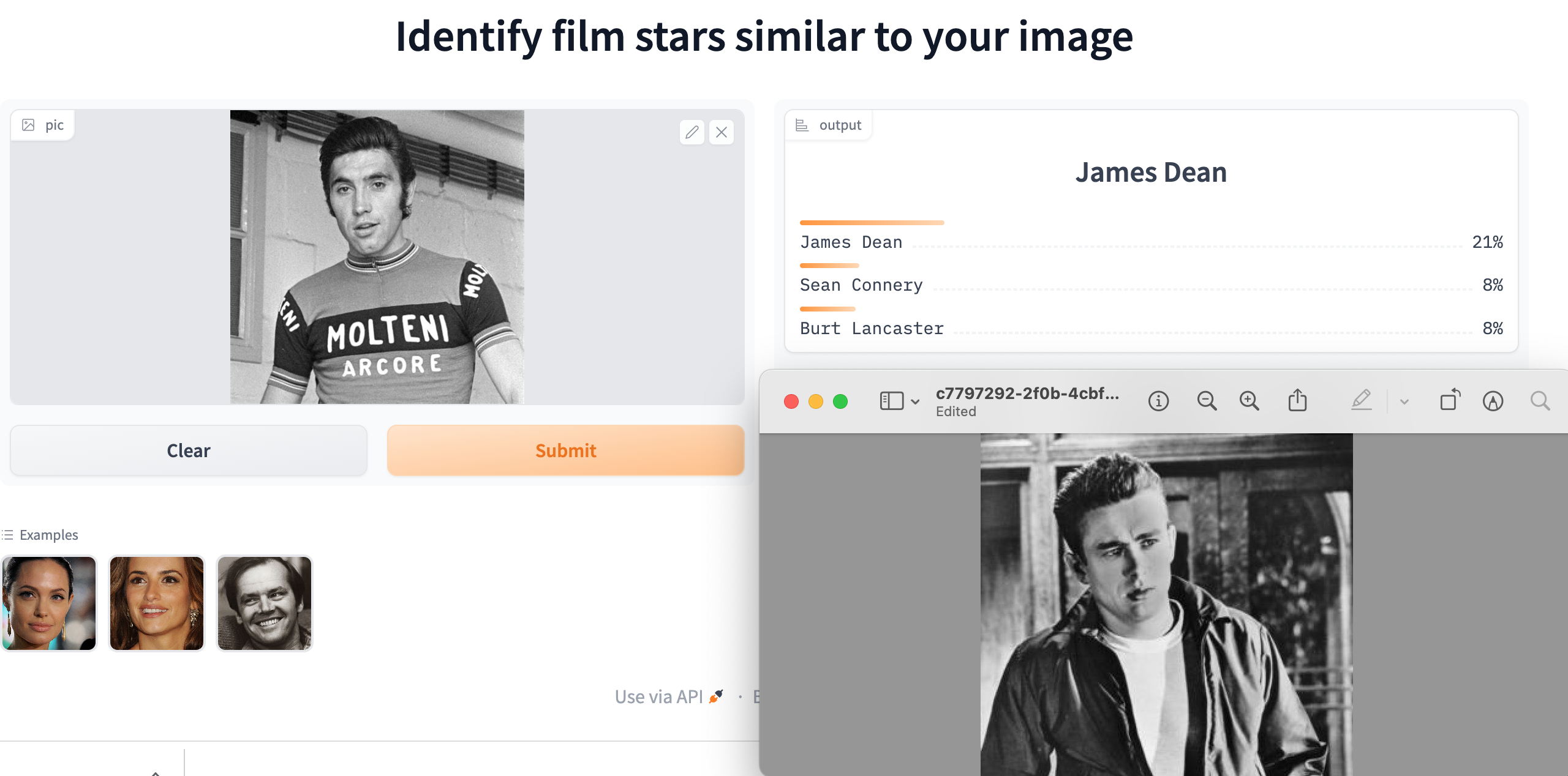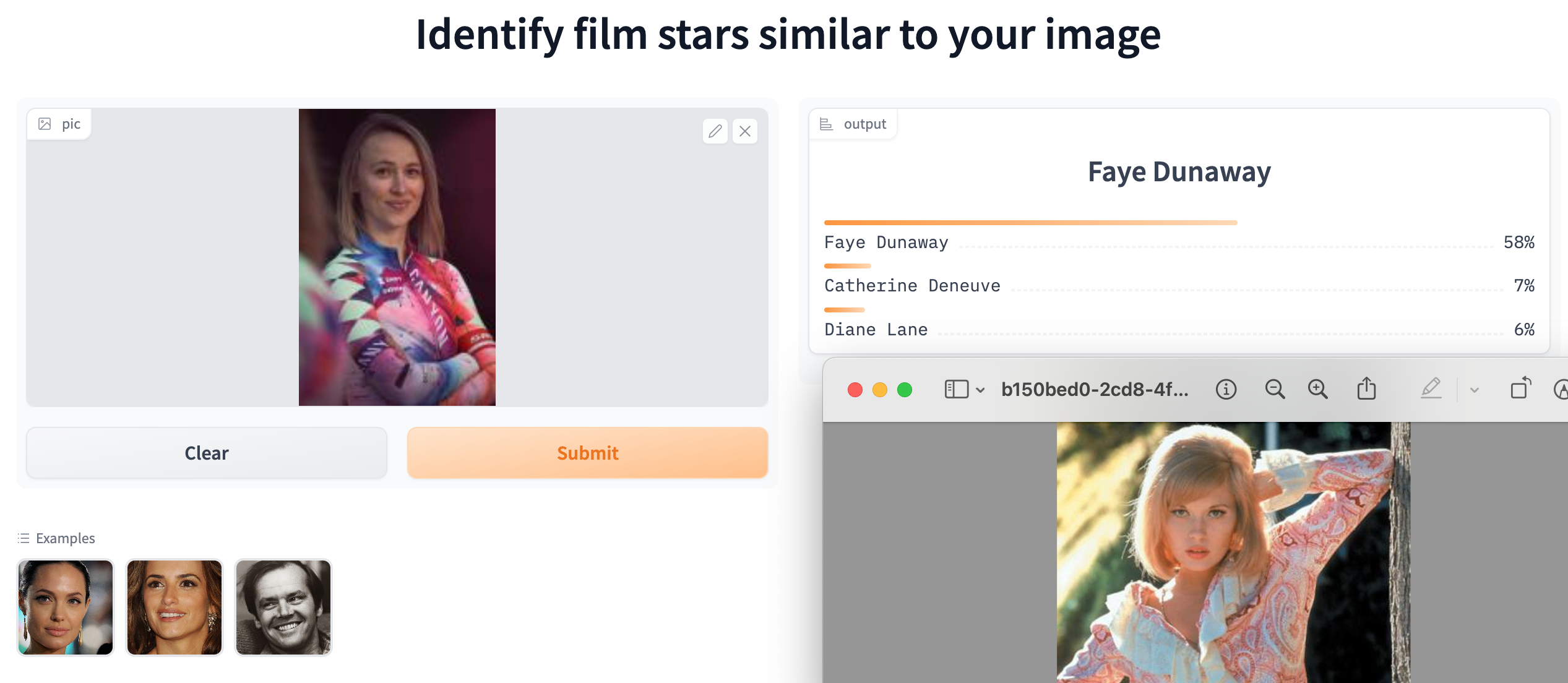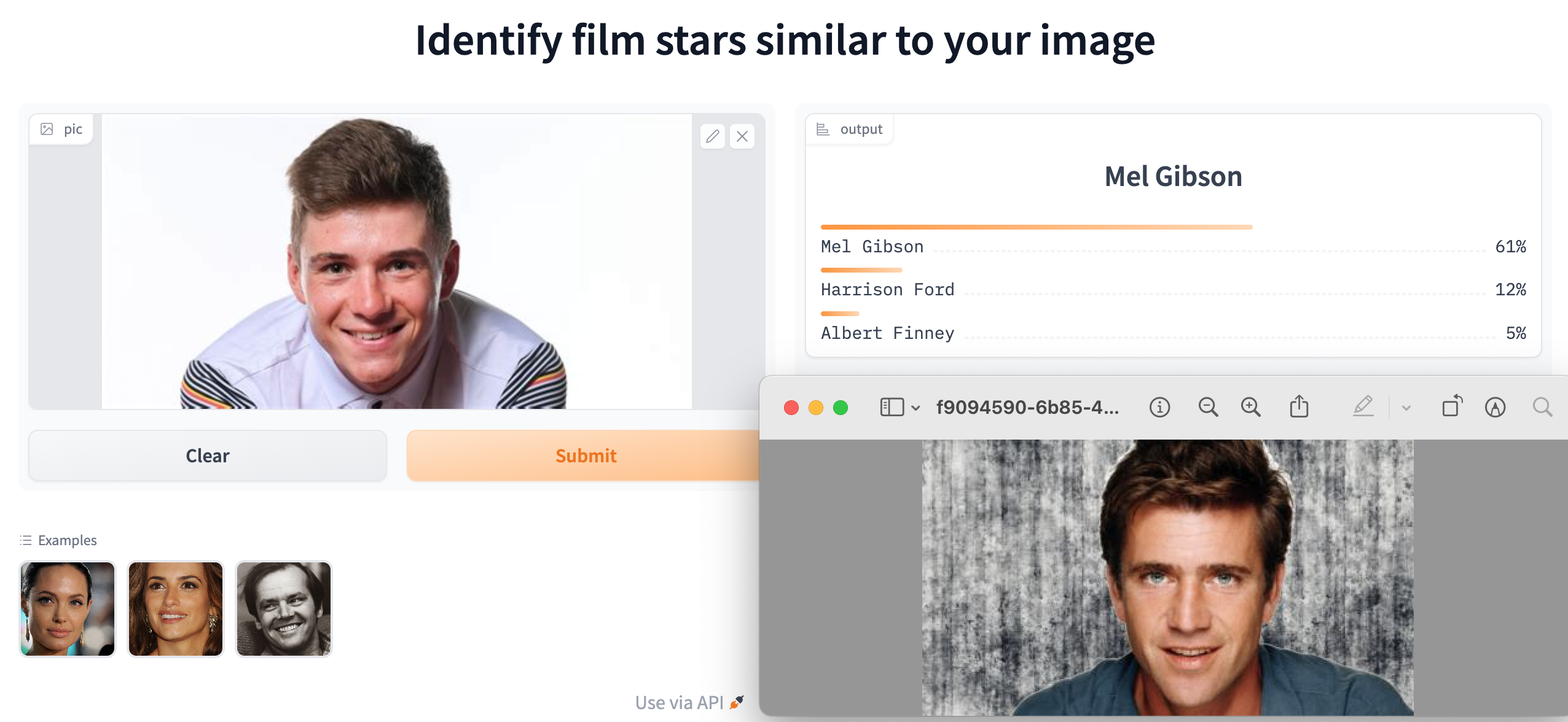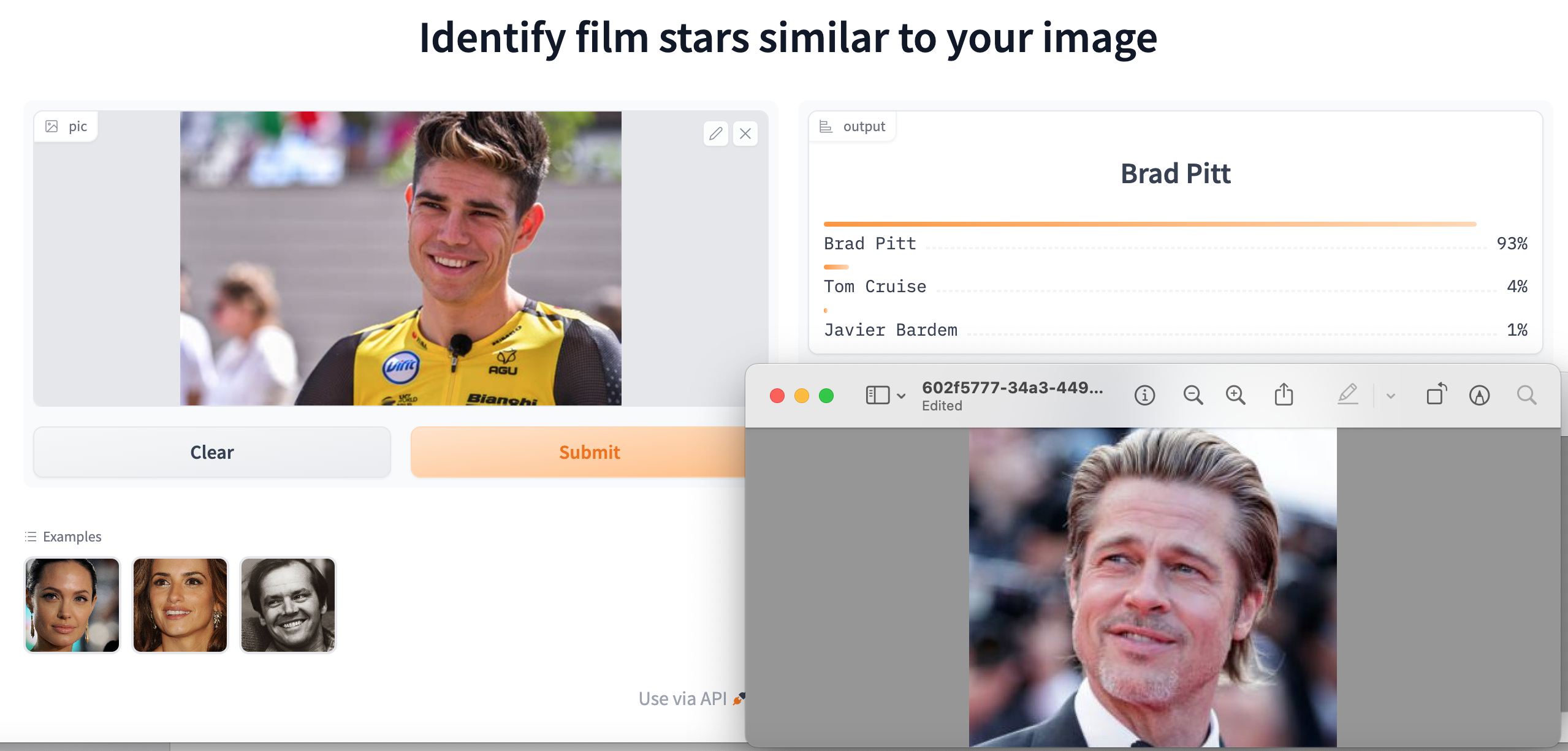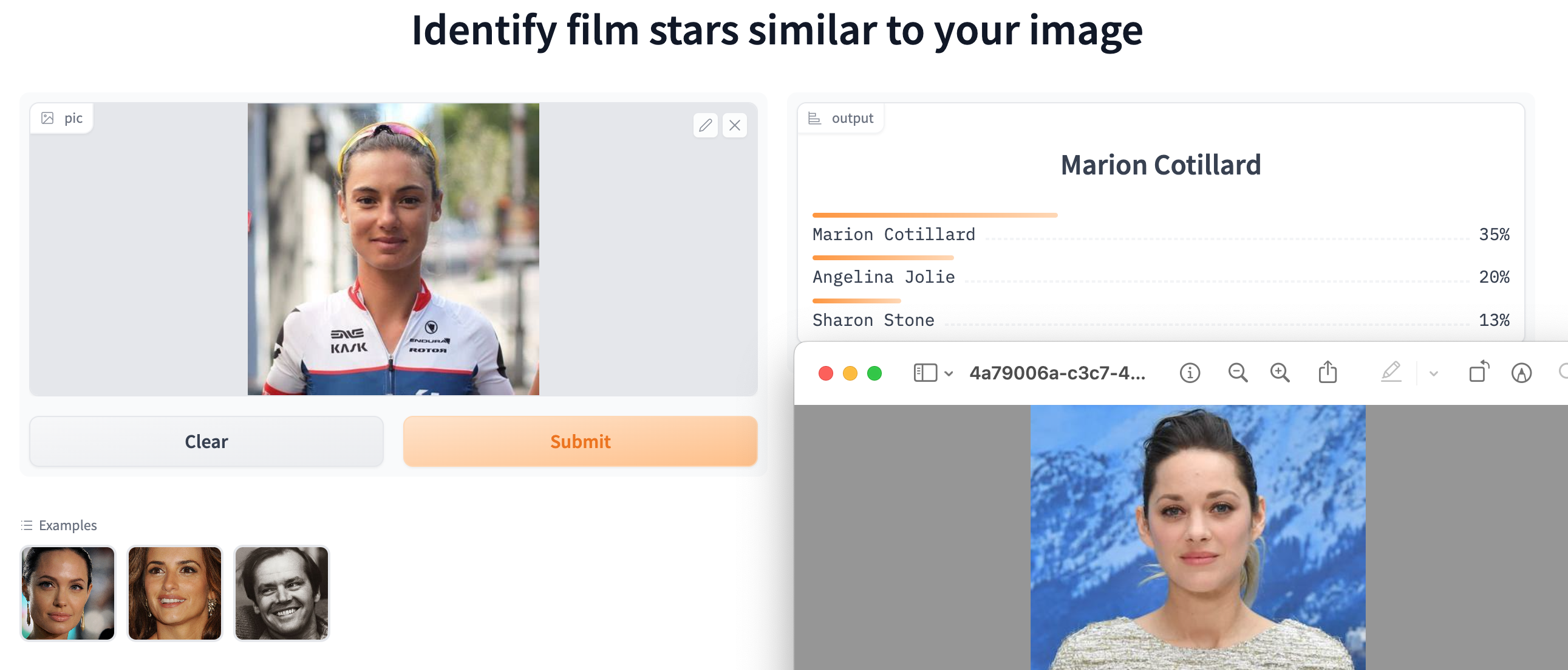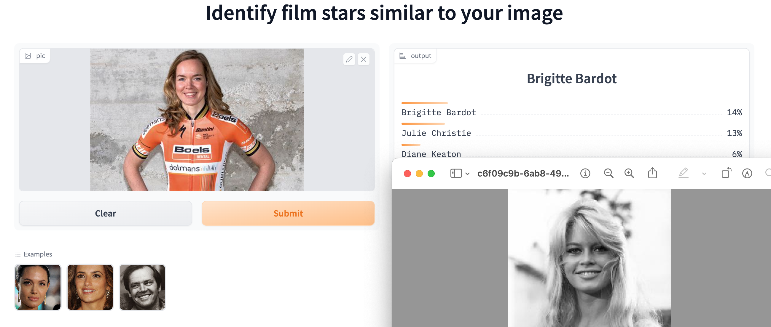
Should Eddy Merckx win an Oscar? Could the boyish looks of Tadej Pogačar or Remco Evenepoel make it in the movies? Would Mathieu van der Poel’s chiselled chin or Wout van Aert strong features help them lead the cast in the next blockbuster? I built a FilmStars app to find out.
Taking advantage of the fantastic deep learning library provided by fast.ai, I downloaded and cleaned up 100 photos of IMDb’s top 100 male and female stars. Then I used a free GPU on Kaggle to fine-tune a pre-trained Reset50 neural net architecture to identify movie stars from their photos. It took about 2 hours to obtain an accuracy of about 60%. There is no doubt that this model could be greatly improved, but I stopped at that point in the interest of time. After all, 60% is a lot better than the 0.5% obtained from random guessing. Then I used HuggingFace to host my app. The project was completed in two days with zero outlay for resources.
It is quite hard to identify movie stars, because adopting a different persona is part of the job. This means that actors can look very different from one photo to the next. They also get older: sadly, the sex bombs of the ’60s inevitably become ageing actresses in their sixties. So the neural network really had its work cut out to distinguish between 200 different actors, using a relatively small sample of data and only a short amount of training.
Breaking away
Creating the perfect film star identifier was never really the point of the app. The idea was to allow people to upload images to see which film stars were suggested. If you have friend who looks like Ralph Fiennes, you can upload a photo and see whether the neural net agrees.
I tried it out with professional cyclists. These were the top choices.
Eddy Merckx
James Dean
Tadej Pogačar
Matt Damon
Remco Evenepoel
Mel Gibson
Mathieu van der Poel
Leonardo DiCaprio
Wout van Aert
Brad Pitt
Marianne Vos
Jodie Foster
Ashleigh Moolman
Marion Cotillard
Katarzyna Niewiadoma
Faye Dunaway
Anna van der Breggen
Brigitte Bardot
Cycling Stars
In each case I found an image of the top choice of film star for comparison.
The model was more confident with the male cyclists, though it really depends on the photo and even the degree of cropping applied to the image. The nice thing about the app is that people like to be compared to attractive film stars, though there are are few shockers in the underlying database. The model does not deal very well with beards and men with long hair. It is best to use a “movie star” type of image, rather than someone wearing cycling kit.
One of the big differences between amateur and professional cycle racing is the role of the breakaway. Amateur racing usually consists of a succession of attacks until a group of strong riders breaks away and disappears into the distance to contest the win. There is rarely enough firepower left in the peloton to close down the gap.
This contrasts with professional racing, where a group of weaker riders typically contests for the breakaway, hoping that the pursuing teams will miscalculate their efforts to bring their leaders to the head of the race in the final kilometres. Occasionally a solo rider launches a last minute attack, forcing other riders to chase.
One minute for every ten kilometres
Much of the excitement for cycling fans is generated by the tension between the breakaway and the peloton, especially when the result of the race hangs in the balance until the final metres. Commentators often say that the break needs a lead of at least one minute for every ten kilometres before the finish line. Where does this rule of thumb come from?
It’s time for some back of the envelope calculations. On flat terrain, the breakaway may ride the final 10km of a professional race at about 50kph. A lead of one minute equates to a gap of 833m, which the peloton must close within the 12 minutes that it will take the breakaway riders to reach the finish line. This means the peloton must ride at 54.2kph, which is just over 8.3% faster than the riders ahead.
On a flat road power would be almost exclusively devoted to overcoming aerodynamic drag. The effort rises with the cube of velocity, so the power output of the chasing riders needs to be 27% high. If the breakaway riders are pushing out 400W, the riders leading the chasing group need to be doing over 500W.
The peloton has several advantages. Riding in the bunch saves a lot of energy, especially relative to the efforts of a small number of riders who have been in a breakaway all day. This means that many riders have energy reserves available to lift the pace at the end of the race. Teams are drilled to deploy these reserves efficiently by drafting behind the riders who are emptying themselves at the front of the chasing pack. Having the breakaway in sight provides a psychological boost as the gap narrows. The one minute rule suggests these benefits equate to a power advantage of around 25%.
Not for an uphill finish
If the race finishes on a long climb, a one minute lead is very unlikely to be enough for the break to stay away. Ascending at 25kph equates to a gap of only 417m and now the peloton has 25 minutes to make up the difference. This can be achieved by riding at 26kph. This is just 4% faster, requiring 13% higher power to overcome the additional aerodynamic drag. This would be about 450W, if the break is holding 400W.
The chasing peloton still has fresher riders, who may be able to see the break up the road, they do not have the same drafting advantages when climbing at 26kph. The other big factor is gravity. The specialist climbers are able to put in strong accelerations on steep sections, quickly gaining on those ahead. They can climb faster than heavier riders at equivalent power.
If we take the same figure for the power advantage over the break as before, of around 25%, the break would need to have a lead of 1 minute 55 seconds as it passes the 10km banner. However, experience suggests that unless there is a very strong climber in the break, a much bigger time gap would be required for the break to stay away.
Chasing downhill
This analysis also explains why it is very difficult to narrow a gap on a fast descent. Consider a 10km sweeping road coming down from an alpine pass to the valley. Riding at 60kph, a one minute gap equates to 1km. The peloton would have to average 66kph over the whole 10km in order to make the catch in then ten minute descent. In spite of the assistance of gravity, the 10% higher speed converts into a 33% increase in the effect of drag, where riders begin to approach terminal velocity.
Amateur breaks
Amateurs do not have the luxury of a directeur sportif running a spreadsheet in a following team car. In fact you are lucky if you anyone gives you an idea of a time gap. The best strategy is firstly to follow the attacks of the strongest riders in order to get into a successful break and then encourage your fellow breakaway riders, verbally and by example, to ride through and off, in order to establish a gap. As you get closer to the finish, you should assess the other riders in order to work out how you are going to beat them over the line.
Click on the image to hear some music I composed. It was featured on The Cycling Podcast for Stage 14 of the Tour de France 2021. The tune is free to download.
These are the lyrics.
The boy prince
Who’s the guy in yellow up the road? He’s a kind of mellow looking dude Who’s the guy in yellow up the road? Motivated fellow looking good.
Alaphilippe Mathieu van der Poel You were digging deep But guess who’s on a roll Tadej Pogacar We know who you are Tadej Pogacar You’re a superstar!
Faster in the TT than a train Riding up the Giant of Provence Winner of a grand tour once again? Boy prince of the tour: princeling of the Tour de France.
Alaphilippe Mathieu van der Poel Your were digging deep But guess who’s on a roll Tadej Pogacar We know who you are Tadej Pogacar You’re a superstar!
Who’s the guy in yellow riding up the road? He’s a kind of mellow gentle-looking dude Who’s the guy in yellow rolling up the road? Motivated fellow: he’s sure looking good Faster in the TT faster than a train Riding up Mont Ventoux, Giant of Provence Winner of a grand tour, in Paris once again? Boy prince of the tour: princeling of the Tour de France.
Last time I tried to predict a race, I trained up a neural network on past race results, ahead of the World Championships in Harrogate. The model backed Sam Bennett, but it did not take account of the weather conditions, which turned out to be terrible. Fortunately the forecast looks good for tomorrow’s Milan Sanremo.
This time I have tried using a Random Forest, based on the results of the UCI races that took place in 2020 and so far in 2021. The model took account of each rider’s past results, team, height and weight, together with key statistics about each race, including date, distance, average speed and type of parcours.
One of the nice things about this type of model is that it is possible to see how the factors contribute to the overall predictions. The following waterfall chart explains why the model uncontroversially has Wout van Aert as the favourite.
Breakdown of prediction for Wout van Aert
The largest positive contribution comes from being Wout van Aert. This is because he has a lot of good results. His height and weight favour Milan Sanremo. He also has a strong positive coming from his team. This distance and race type make further positive contributions.
We can contrast this with the model’s prediction for Mathieu van der Poel, who is ranked 9th.
Breakdown of prediction for Mathieu van der Poel
We see a positive personal contribution from being van der Poel, but having raced fewer UCI events, he has less of a strong set of results than van Aert. According to the model the Alpecin Fenix team contribution is not a strong as Jumbo Visma, but the long distance of the race works in favour of the Dutchman. The day of year gives a small negative contribution, suggesting that his road results have been stronger later in the year, but this could be due to last year’s unusual timing of races.
Each of the other riders in the model’s top 10 is in with a shout.
It’s taken me all afternoon to set up this model, so this is just a short post.
Post race comment
Where was Jasper Stuyven?
Like Mads Pedersen in Harrogate back in 2019, Jasper Stuyven was this year’s surprise winner in Sanremo. So what had the model expected for him? Scrolling down the list of predictions, Stuyven was ranked 39th.
Breakdown of prediction for Jasper Stuyven
His individual rider prediction was negative, perhaps because he has not had many good results so far this year, though he did win Omloop Het Nieuwsblad last year and had several top 10 finishes. The model assessed that his greatest advantage came from the length of the race, suggesting that he tends to do well over greater distances.
The nice thing about this approach is that that it identifies factors that are relevant to particular riders, in a quantitative fashion. This helps to overcome personal biases and the human tendency to overweight and project forward what has happened most recently.
An attractive aspect of hexagonal patterns is that they can repeat in interesting ways across a cycling jersey. This is partly due to the fact that a hexagon can be divided up into three equal lozenge shapes, as seen near the neck of the top right jersey. These shapes can be combined in imaginative ways, as displayed in the lower two examples.
This three-way division of a hexagon can create a 3D optical illusion called a “Necker cube”, which can appear to flip from convex to concave and back again. The orange patch can appear to be the top of a cube viewed from above or the ceiling in a corner, viewed from below. See if this happens if you stare at the image below.
Looking down on a cube or up into the corner of a room?
Spoiler alert: from here things gets a bit mathematical
Tessellations
A tessellation, or tiling, is a way of covering a plane with polygons of various types. Tessellations have many interesting mathematical properties relating to their symmetries. It turns out that there are exactly 17 types of periodic patterns. Roger Penrose, who was awarded the 2020 Nobel Prize in Physics for his work on the formation of black holes, discovered many interesting aperiodic tilings, such as the Penrose tiling.
While some people were munching on mince pies before Christmas, I watched a thought-provoking video on a related topic, released by the Mathologer, Burkard Polster. He begins by discussing ways of tiling various shapes with dominoes and goes on describe something called the Arctic Circle Theorem. Around the middle of the video, he shifts to tiling hexagon shapes with lozenges, resulting in images with the weird 3D flipping effect described above. This prompted me to spend rather a lot of time writing Python code to explore this topic.
After much experimentation, I created some code that would generate random tilings by stochastically flipping hexagons. Colouring the lozenges according to their orientation resulted in some really interesting 3D effects.
Algorithm flips a random hexagon to create a new tiling.
Neckered
The video shows random tilings of a hexagonal area. These end up looking like a collection of 3D towers with orange tops. But if you focus on a particular cube and tilt your screen backwards, the whole image can flip, Necker-style into an inverted version where the floor becomes the ceiling and the orange segments push downwards.
I used my code to create random tilings of much bigger hexagons. It turned out that plotting the image on every iteration was taking a ridiculous amount of time. Suspending plotting until the end resulted in the code running 10,000 time faster! This allowed me to run 50 million iterations for a hexagon with 32 lozenges on each size, resulting in the fabled Arctic Circle promised by the eponymous theorem. The central area is chaotic, but the colours freeze into opposite solid patches of orange, blue and grey outside the circumference of a large inscribed circle.
Arctic Circle emerged on a hexagon of side 32 after 50 million iterations
Why does the Arctic Circle emerge?
There are two intuitive ways to understand why this happens. Firstly, if you consider the pattern as representing towers with orange tops, then every tower must be taller than the three towers in front of it. So if you try to add or remove a brick randomly, the towers at the back are more likely to become taller, while those near the front tend to become shorter.
Two examples of paths from left to right
The second way to think about it is that, if you look carefully, there is a unique path from each of the lozenges on the left hand vertical side to the corresponding lozenge on the right hand vertical side. At every step, each path either goes up (blue) or down (grey). The gaps between the various paths are orange. Each step of the algorithm flips between up-down and down-up steps on a particular path. On the large hexagon, the only way to prevent the topmost cell from being orange is for the highest path to go up (and remain blue) 32 times in a row. This is very unlikely when flips are random, though it can happen more often on a smaller size-6 hexagon like the one shown in the example.
Resources
A Jupyter notebook demonstrating the approach and Python code for running longer simulations are available on this GitHub page.
Back to cycling jerseys
The Dutch company DSM is proudly sponsoring a professional cycling team in 2021. And a hexagon lies at the heart of the DSM logo, that will appear on the team jerseys.
The COVID-19 pandemic has further exposed the weakness of the professional cycling business model. The competition between the teams for funding from a limited number of sponsors undermines the stability of the profession. With marketing budgets under strain, more teams are likely to face difficulties, in spite of the great advertising and publicity that the sport provides. Douglas Ryder is fighting an uphill struggle trying to keep his team alive after the withdrawal of NTT as a lead sponsor. One aspect of stability is financial, but another measure is the level of transfers between teams.
The composition of some teams is more stable than others. This is illustrated by analysing the history of riders’ careers, which is available on ProCyclingStats. The following chart is a network of the transfers between teams in the last year, where the yellow nodes are 2020 teams and the purple ones are 2019. The width of the edges indicates how many riders transferred between the teams, with the thick green lines representing the bulk of the riders who stuck with the same team. The blue labels give the initials of the official name of each team, such as M-S (Mitchelton-Scott), MT (Movistar Team), T-S (Trek-Segafredo) and TS (Team Sunweb). Riders who switched teams are labelled in red.
Although there is a Dutch/German grouping on the lower right, the main structure is from the outside towards the centre of the network.
The spikes around the end of the chart show riders like Geoffrey Soupe or Rubén Fernández, who stepped down to smaller non World Tour teams like Team Total Direct Energie (TTDE), Nippo Delko One Provence (NNDP), Euskaltel-Euskadi (E-E), Androni Giocattoli-Sidermec (AG-S ) or U-XPCT (Uno-X Pro Cycling Team).
The two World Tour outliers were Mitchelton-Scott (M-S) and Groupama FDJ (GF), who retained virtually all their riders from 2019. Moving closer in, a group of teams lies around the edge of the central mass, where a few transfers occurred. Moving anti-clockwise we see CCC Team (CT), Astana Pro Team (APT), Trek-Segafredo (T-S), AG2R Le Mondial (ALM), Circus-Wanty Gobert (C-WG), Team Jumbo Visma (TJV), Bora-Hansgrohe (B-H) and EF Pro Cycling (EPC).
Deeper in the mêlée, Ineos (TI_19/IG_20), Deceuninck – Quick Step (D-QS), UAE-Team Emirates (U-TE), Lotto Soudal (LS), Bahrain – McLaren (B-H) and Movistar Team(MT) exchanged a number of riders.
Right in the centre Israel Start-Up Nation (IS-UN) grabbed a whole lot of riders, including 7 from Team Arkéa Samsic (TAS). Meanwhile likes of Victor Campenaerts and Domenico Pozzovivo are probably regretting joining NTT Pro Cycling (TDD_19/NPC_20).
Looking forward
A few of the top riders have contracts for next year showing up on ProCyclingStats. So far 2020/2021 looks like the network below. Many riders are renewing with their existing teams, indicated by the broad green lines. But some big names are changing teams, including Chris Froome, Richie Porte, Laurens De Plus, Sam Oomen, Romain Bardet and Wilco Keldeman, Bob Jungels and Lilian Calmejane.
What about networks of riders?
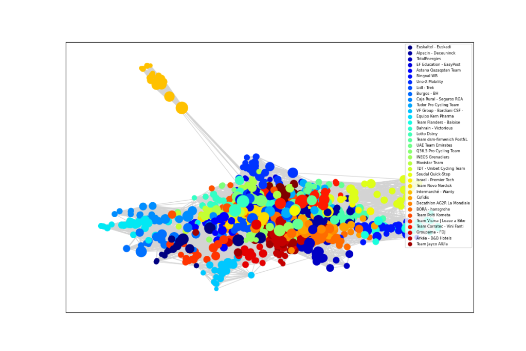
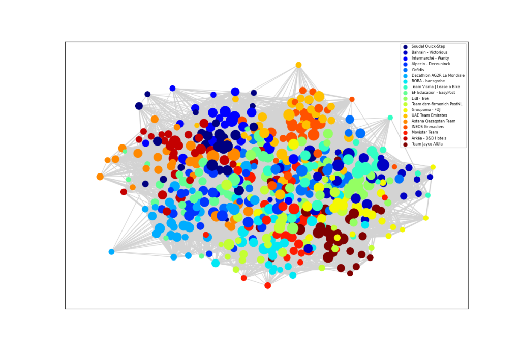
My original thought when starting this analysis was that over their careers, certain riders must have been team mates with most of the riders in today’s peloton, so who is the most connected? Unfortunately this turned out to be ridiculously complicated, as shown in the image below, where nodes are riders with links if they were ever teammates and the colours represent the current teams. The highest ranked rider in each team is shown in red.
It is hard to make much sense of this, other than to note that those with shorter careers in the same team are near the edge and that Philippe Gilbert is close to the centre. Out of interest, the rider around 9 o’clock linking Bora and Jumbo Visma is Christoph Pfingsten, who moved this year. At least we can conclude that professional cyclists are well-connected.
Which Lord of the Rings characters do they look like? Ask an AI.
After building an app that uses deep learning to recognise Lord of the Rings characters, I had a bit of fun feeding in pictures of professional cyclists. This blog explains how the app works. If you just want to try it out yourself, you can find it here, but note that may need to be fairly patient, because it can take up to 5 minutes to fire up for the first time… it does start eventually.
Identifying wizards, hobbits and elves
The code that performs this task was based on the latest version of the excellent fast.ai course Practical Deep Learning for Coders. If you have done bit of programming in Python, you can build something like this yourself after just a few lessons.
The course sets out to defy some myths about deep learning. You don’t need to have a PhD in computer science – the fastai library is brilliantly designed and easy to use. Python is the language of choice for much of data science and the course runs in Jupyter notebooks.
You don’t need petabytes of data – I used fewer than 150 sample images of each character, downloaded using the Bing Image Search API. It is also straightforward to download publicly available neural networks within the fastai framework. These have been pre-trained to recognise a broad range of objects. Then it is relatively quick to fine-tune the parameters to achieve a specific task, such as recognising about 20 different Tolkien characters.
You don’t need expensive resources to build your models – I trained my neural network in just a few minutes, using a free GPU available on Google’s Colaboratory platform. After transferring the essential files to a github repository, I deployed the app at no cost, using Binder.
Thanks to the guidance provided by fastai, the whole process was quick and straightforward to do. In fact, by far the most time consuming task was cleaning up the data set of downloaded images. But there was a trick for doing this. First you train your network on whatever images come up in an initial search, until it achieves a reasonable degree of accuracy. Then take a look at the images that the model finds the most difficult to classify. I found that these tended to be pictures of lego figures or cartoon images. With the help of a fastai tool, it was simple to remove irrelevant images from the training and validation sets.
After a couple of iterations, I had a clean dataset and a great model, giving about 70% accuracy, which as good enough my purposes. Some examples are shown in the left column at the top of this blog.
The model’s performance was remarkably similar to my own. While Gollum is easy to identify, the wizard Saruman can be mistaken for Gandalf, Boromir looks a bit like Faramir and the hobbits Pippin and Merry can be confused.
Applications outside Middle Earth
One of the important limits of these types of image recognition models is that even if they work well in the domain in which they have been trained, they cannot be expected do a good job on totally different images. Nevertheless, I thought it would be amusing to supply the pictures of professional cyclists, particularly given the current vogue for growing facial hair.
My model was 87% sure that Peter Sagan was Boromir, but only 81.5% confident in the picture of Sean Bean. It was even more certain that Daniel Oss played the role of Faramir. Geraint Thomas was predicted to be Frodo Baggins, but with much lower confidence. I wondered for a while with Tadej Pogacar should be Legolas, but perhaps the model interpreted his outstretched arms as those of an archer.
I hoped that a heavily bearded Bradley Wiggins might come out as Gimli, but that did not not seem to work. Nevertheless it was entertaining to upload photographs of friends and family. With apologies for any waiting times to get to it running, you can try it here.
A report in VeloNews on the eve of the Tour de France stated that the French government had insisted that the “two strikes and you are out” policy must be enforced by the ASO. This means that if two positive COVID-19 test arise within a team or its support staff, the team will be removed from the race. This raises the possibility of the yellow jersey rider being ejected from the race if, for example, two mechanics record positive tests. This would be particularly unjust if it turns out that a test result was a false positive. So what are the chances that this might happen?
False positives
One of the great frustrations of the reporting on COVID testing has been the lack of clarity about what type of testing is being discussed. Tests fall in to two categories. Antigen tests use a sample from a nasal or pharyngeal swab to detect patients who currently have the disease, whereas antibody tests use a blood sample to identify patients who have developed antibodies as a result of exposure to the disease in the past – more than 28 days earlier.
There are two general types of antigen test. Real time polymerase chain reaction (RT-PCR) tests looks for specific viral fragments and need to be conducted in a laboratory, typically requiring at least 24 hours for a result. Less reliable rapid tests look for proteins associated with the COVID-19 virus, producing results in as little as 15 minutes.
The UCI requires riders and staff to be tested using RT-PCR, which is a very reliable method, having both high sensitivity (ability to detect those with the disease) and high specificity (ability to clear those without the disease). The relevant question for the Tour de France is the probability of a false positive RT-PRC test. Indeed Larry Warbass recently said he thought his result was a false positive, as he had experienced no symptoms and had maintained strict self isolation during training.
The evidence indicates that the machines performing the RT-PRC test are extremely unlikely to generate a false positive, because the test needs to find significant levels of three different targets to confirm the presence of COVID-19. In FDA experiments, 100% of negatives where correctly identified – there were no false positives. However, it remains possible that, in the moving circus of the Tour de France, a sample could become contaminated before it is tested or that samples might somehow be mislabelled. A high level of responsibility falls on the shoulders of team doctors to minimise these risks, but we can never be sure that it is zero.
One in a thousand
As a thought experiment, suppose that a negative RT-PCR test is 99.9% reliable, i.e. that one COVID-free person in a thousand somehow produces a false positive result. What is the chance that a team is unjustly sent home from the Tour?
Each team has eight riders plus support staff. Although teams might want to reduce the number of staff in the team bubble, it may be necessary to have extra catering staff in order to remain self sufficient. Let us assume an average of 17 staff on each of the 21 teams and that everybody has passed the required two negative tests prior to the start of the race. Assume further that nobody contracts COVID-19 throughout the race.
It has been indicated that everyone will be tested on the two rest days. Reassuringly, the probability of two or more false positives in a single team bubble of 25 people would be 0.03% (1-0.999^(25*2)). However, the probability that every team rider receives a negative result would be only 85% (0.999^168), meaning that there would be a 15% chance that at least one rider is unjustly ejected from the race. In fact, since at total of 1,050 tests would be taken by everyone in a team bubble, the chance of at least one person receiving a false positive would be surprisingly high: 65% (1- 0.999^1050).
Perhaps the assumption of 1 in a thousand false positives was a bit alarmist. Reducing it to 1 in thousand still produces a probability of 10% that somebody would be sent home during the Tour.
Blind eyes
In some situations, draconian sanctions might deter team members or staff from reporting symptoms. One could imagine a soigneur or mechanic having to go home quietly after mysteriously spraining a wrist. However, this could create very negative press coverage if word got out that this person was infected.
Furthermore, the UCI rules place responsibility on the teams and specifically the team doctors to apply strict daily monitoring and controls to detect suspected COVID-19 cases.
Champs Elysées
While in the above scenarios no one actually contracted COVID-19, there is, of course a not inconsiderable chance that one of the 525 people in the team bubbles does actually become infected. If the virus spreads to more than one team, the whole race could become a fiasco.
But let’s keep our fingers crossed and hope Tour makes it to the Champs Elysées.
It was shocking to see footage of Remco Evenepoel’s horrific crash in Il Lombardia. Reports indicate that he broke his pelvis after falling from a bridge into a ravine. This follows the injuries sustained by his Deceuninck-QuickStep team mate Fabio Jakobsen in the Tour of Poland.
The video above shows the repairs to my pelvis carried out by the specialist team at St George’s Hospital. My accident was less spectacular than Remco’s, I just hit a large pothole, while riding in the Kent lanes last March. It took the ambulance two and a half hours to arrive, as this was just at the beginning of the COVID-19 crisis. In fact, lock-down was announced on the evening of my crash. There was a lot of uncertainty about the virus back then, so it was a pretty scary time to be in hospital. Nevertheless I have immense respect and gratitude for the NHS staff who looked after me.
I was given crutches the day after the operation and returned home the day after that, with strict instructions to remain non-weight-bearing on the injured leg for six weeks and then only partial weight-bearing for the next six weeks. An NHS physiotherapist contacted me and regularly provided a progression of exercises. I set myself additional challenges, like doing extra press-ups.
After six weeks of doing no proper exercise, I had lost 4kg. The circumference of my left thigh was 5cm less than the right. However, following a review at the hospital, I was given permission to start gentle exercise on my static turbo trainer. I began by removing the left pedal and performing single leg drills, but after a couple of days it was easier to put my injured leg on the pedal as a passenger. This also gave the hip some mobility.
After a week on the turbo, I was up to one hour a day at about 160 watts. It took a long time to increase this above 200 watts. I watched a lot of old cycling films, without any particular urge to go on Zwift. I started riding outside in mid-June, 12 weeks post op. My Garmin pedals allowed me to monitor the left-right balance as well as average power.The following chart shows that 21 weeks after my accident, balance is hovering around 48:52 and five minute power is back over 300 watts.
Left/Right Balance and 5 minute Peak Power, since crash date
The psychological aspect of rehabilitation has been very important. I have focussed on targets and deadlines, marking each little achievement as a milestone. I am now walking without a limp, though running is still off limits. I even went kitesurfing a couple of weeks ago (don’t tell my surgeon about that one). I have been busy learning Italian, composing music and programming in Python.
Since heading back out on the roads, I have been riding cautiously, as my hip will not regain full strength until next spring. I plan to enter a couple of time trials to rekindle a sense of competition, without the danger of riding in a peloton. Racing again next season remains a goal.
Probably the most important mental aspect has been to stay positive at all times and never to spend time feeling sorry for oneself. This has been difficult as, inevitably, there have been a couple of set-backs when progress has seemed to reverse. But on the whole, my recovery has been astounding and, like Chris Froome, I remain optimistic about regaining my peak.
Remco will be back on the road next season, with the potential to pick up some results later in the year.
As a growing number of people seek to educate themselves on coronavirus COVID-19, while confined to their homes, a better understanding can be gained by taking a look at how to model an epidemic.
Researchers have created highly complex models of the spread of infections. For example, BlueDot’s disease-tracking model, described in this podcast, monitors the Internet with AI language translators and evaluates the network effects of transmission based on air travel itineraries. However, a surprising amount of insight can be gained from a very simple approach called the SIR model.
SIR model
The SIR model divides the population into three classes. The susceptible class (S) includes everyone who can catch the infection. In the case of a novel virus like corona, it seems that the entire global population was initially susceptible. The infected class (I) includes all those currently infected and able to transmit the virus to susceptible people. The removed class (R) includes everyone who has recovered from the virus or, unfortunately, died. In the model, these people no longer transmit the disease nor are they susceptible. The idea is that people move from the susceptible class to the infected class to the removed class.
Although there is much focus in the media on the exponential rise of the total number of cases of coronavirus, this figure includes recoveries and deaths. In one sense this is a huge underestimate, because the figures only includes people who have taken a test and returned a positive result. As explained by Tomas Pueyo, many people do not display symptoms until around 5 days after infection and for over 90% these symptoms are mild, so there could be ten times more people infected than the official figures suggest. In another sense, the figures are a huge exaggeration, because people who have recovered are unlikely to be infectious, because their immune systems have fought off the virus.
The SIR model measures the number of infectious people. On the worldometers site these are called “active cases”. The critical insight of the SIR model, shown in the diagram above, is that the class of infected people grows if the daily number of new cases exceeds the number of closed cases.
Closed cases – removal rate
In a real epidemic, experts don’t really know how many people are infected, but they can keep track of those who have died or recovered. So it is best to start by considering the rate of transfer from infected to removed. After some digging around, it appears that the average duration of an infection is about 2 weeks. So in a steady state situation, about on person in 14 or 7% of those infected would recover every day. This percentage would be a bit less than this if the epidemic is spreading fast, because there would be more people who have recently acquired the virus, so let’s call it 6%. For the death rate, we need the number of deaths divided by the (unknown) total number of people infected. This is likely to be lower than the “case fatality rate” reported on worldometers because that divides the number of deaths only be the number of positive tests. The death rate is estimated to be 2-3%. If we add 3% to the 6% of those recovering, the removal rate (call it “a”) is estimated to be 9%.
In the absence of a cure or treatment for the virus, it is unlikely that the duration of infectiousness can be reduced. As long as hospitals are not overwhelmed, those who might otherwise have died may be saved. However, there is not much that governments or populations can do to speed up the daily rate of “closed cases”. The only levers available are those to reduce the number of “new cases” below 9%. This appeared to occur as a result of the draconian actions taken in China in the second half of February, but the sharp increase in new cases that became apparent over the weekend of 6/7 March spooked the financial markets.
New cases – infection rate
In the SIR model, the number of new infections depends on three factors: the number of infectious people, the number of susceptible people and the something called the infection rate (r), which measures the probability that an infected person passes on the virus to a susceptible person either through direct contact or indirectly, for example, by contaminating a surface, such as a door handle.
Governments can attempt to reduce the number of new infections by controlling each of the three driving factors. Clearly, hand washing and avoiding physical contact can reduce the infection rate. Similarly infected people are encouraged to isolate themselves in order to reduce the proportion of susceptible people exposed to direct or indirect contact. Guidance to UK general practitioners is to advise patients suffering from mild symptoms to stay at home and call 111, while those with serious symptoms should call 999.
When will it end?
As more people become infected, the number of susceptible people naturally falls. Until there is a vaccine, there is nothing governments can do to speed up this decline. Eventually, when enough people will have caught the current strain of the virus, so-called “herd immunity” will prevail. It is not necessary for everyone to have come into contact with the virus, rather it is sufficient for the number of susceptible people to be smaller than a critical value. Beyond this point infected people, on average, recover before they encounter a susceptible person. This is how the epidemic will finally start to die down.
When people refer to the transmission rate or reproduction rate of a virus, they mean the number of secondary infections produced by a primary infection across a susceptible population. This is equal to the number of susceptible people times the infection rate divided by the removal rate. This determines the threshold number of susceptible people below which the number of infections falls. The critical value is equal to removal rate relative to the infection rate (a/r) . When the number of susceptible people falls to this critical value, the number of infected people will reach a peak and subsequently decline. More susceptible people will still continue to be infected, but at a decreasing rate, until the infection dies out completely, by which time a significant part of the population will have been infected.
This looks very scary indeed
Running the figures through the SIR model produces some extremely scary predictions. At the time of writing, new cases of infection were rising at a rate of about 15%. At this rate, the virus could spread to 2/3 of the population before it dies out. If three percent of those infected die, the virus would kill 2 percent of the population. Based on results so far these would be largely elderly people or those suffering from complications, so it is extremely important that they are protected from infection. If the virus continues to run out of control, the number of deaths could run into the millions before the epidemic ends.
It is absolutely essential to reduce the infection rate and keep it low, particularly among the elderly and vulnerable groups
We should watch China carefully for new cases. If none arise, it suggests that a large proportion of the population gained immunity through infection, even though lower numbers of infections were reported. However, if the imposition of constraints temporary reduced the infection rate, leaving a large susceptible pool still vulnerable, the epidemic could re-emerge once the constraints are relaxed.
What to do?
The imposition of governments restrictions on travel and large gatherings are forcing the people to rethink their options. Where possible, office workers, university students, schoolchildren and sportsmen may find themselves congregating online in virtual environments rather than in the messy and dangerous real world.
Among cyclists, this ought to be good news for Zwift and other online platforms. Zwift seems to be particularly well-positioned, due to its strong social aspect, which allows riders to meet and race against each other in virtual races. It also has the potential to allow world tour teams to compete in virtual races.
In fact the ability to meet friends and do things together virtually would have applications across all walks of life. Sports fans need something between the stadium and the television. Businesses need a medium that fills the gap between a physical office and a conference call. Schools and universities require better ways to ensure that students can learn, while classrooms and lecture theatres are closed. These innovations may turn out to be attractive long after the coronavirus scare has subsided.
While the prospect of going to the pub or a crowded nightclub loses its appeal, cycling offers the average person a very attractive alternative way to meet friends while avoiding close proximity with large groups of people. As the weather improves, the chance to enjoying some exercise in the fresh air looks ever more enticing.