Cycling Data Science – building models


Screen Shot 2017-12-24 at 21.19.31.pngIn the previous blog, I explored the structure of a data set of summary statistics from over 800 rides recorded on my Garmin device. The K-means algorithm was an example of unsupervised learning that identified clusters of similar observations without using any identifying labels. The Orange software, used previously, makes it extremely easy to compare a number of simple models that map a ride’s statistics to its type: race, turbo trainer or just a training ride. Here we consider Decision Trees, Random Forests and Support Vector Machines.

Decision Trees

Perhaps the most basic approach is to build a Decision Tree. The algorithm finds an efficient way to make a series of binary splits of the data set, in order to arrive at a set of criteria that separates the classes, as illustrated below.
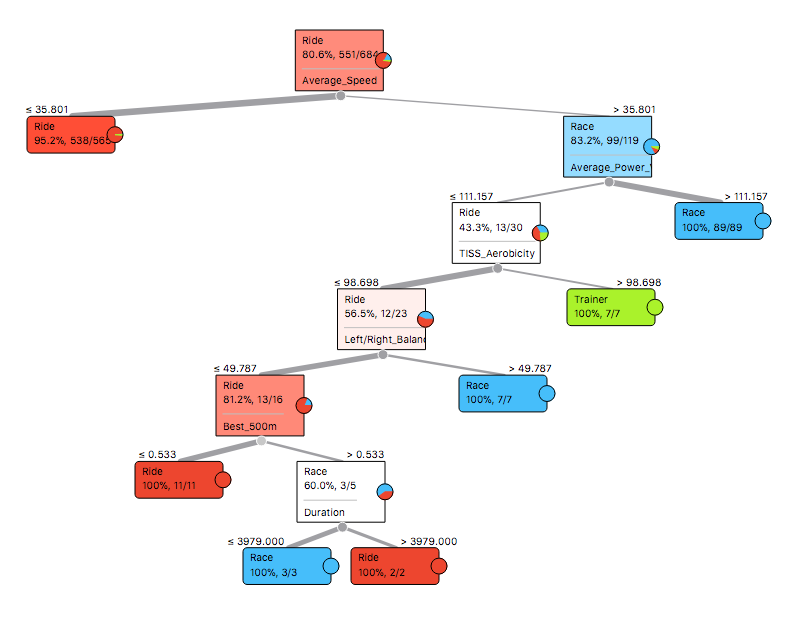
Tree
Decision Tree

The first split separates the majority of training rides from races and turbo trainer sessions, based on an average speed of 35.8km/h. Then Average Power Variance helped identify races, as observed in the previous blog. After this, turbo trainer sessions seemed to have a high level of TISS Aerobicity, which relates to the percentage of effort done aerobically. Pedalling balance, fastest 500m and duration separated the remaining rides. An attractive way to display these decisions is to create a Pythagorean Tree, where the sides of each triangle relate to the number of observations split by each decision.

Screen Shot 2017-12-24 at 16.32.02
Pythagorean Tree

Random Forests

Many alternative sets of decisions could separate the data, where any particular tree can be quite sensitive to specific observations. A Random Forest addresses this issue by creating a collection of different decision trees and choosing the class by majority vote. This is the Pythagorean Forest representation of 16 trees, each with six branches.

Pythagorean1
Pythagorean Forest

Support Vector Machines

A Support Vector Machine (SVM) is a widely used model for solving this kind of categorisation problem. The training algorithm finds an efficient way to slice the data, that largely separates the categories, while allowing for some overlap. The points that are closest to the slices are called support vectors. It is tricky to display the results in such a high dimensional space, but the following scatter plot displays Average Power Variance versus Average Speed, where the support vectors are shown as filled circles.

SVM
Support Vectors shown as filled circles

Comparison of results

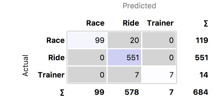
A Confusion Matrix provides a convenient way to compare the accuracy of the models. This correlates the predictions versus the actual category labels. Out of the 809 rides, only 684 were labelled. The Decision Tree incorrectly labelled 20 races and 7 turbos as training rides. The Random Forest did the best job, with only six misclassifications, while the SVM made 11 errors.

Looking at the classification errors can be very informative. It turns out that the two training rides classified as races by the SVM had been accidentally mislabelled – they were in fact races! Furthermore, looking at the five races the that SVM classified as training rides, I punctured in one, I crashed in another and in a third race, I was dropped from the lead group, but eventually rolled in a long way behind with a grupetto. The Random Forest also found an alpine race where my Garmin battery failed and classified it as a training ride. So the misclassifications were largely understandable.

After correcting the data set for mislabelled rides, the Random Forest improved to just two errors and the SVM dropped to just eight errors. The Decision Tree deteriorated to 37 errors, though it did recognise that the climbing rate tends to be zero on a turbo training session.

Prediction

Having trained three models, we can take a look at the sample of 125 unlabelled rides. The following chart shows the predictions of the Random Forest model. It correctly identified one race and suggested several turbo trainer sessions. The SVM also found another race.

asapv
Random Forest predictions of unlabelled rides

Conclusions

Several lessons can be learned from these experiments. Firstly, it is very helpful to start with a clean data set. But if this is not the case, looking at the misclassified results of a decent model can be useful in catching mislabelled data. The SVM seemed to be good for this task, as it had more flexibility to fit the data than the Decision Tree, but it was less prone to overfit the data than the Random Forest.

The Decision Tree was helpful in quickly identifying average speed and power variance (chart below) as the two key variables. The SVM and Random Forest were both pretty good, but less transparent. One might improve on the results by combining these two models.

apv
Distribution of APV (large peak at zero is where no power was recorded for ride)

The next blog will explore this topic further.


Strava Fitness and Freshness

The last blog explored the statistics that Strava calculates for each ride. These feed through into the Fitness & Freshness chart provided for premium users. The aim is to show the accumulated effect of training through time, based on the Training-Impulse model originally proposed by Eric Banister and others in a rather technical paper published in 1976.

Strava gives a pretty good explanation of Fitness and Freshness. A similar approach is used on Training Peaks in its Performance Management Chart. On Strava, each ride is evaluated in terms of its Training Load, if you have a power meter, or a figure derived from your Suffer Score, if you just used a heart rate monitor. A training session has a positive impact on your long-term fitness, but it also has a more immediate negative effect in terms of fatigue. The positive impact decays slowly over time, so if you don’t keep up your training, you lose fitness. But your body is able to recover from fatigue more quickly.

The best time to race is when your fitness is high, but you are also sufficiently recovered from fatigue. Fitness minus fatigue provides an estimate of your form. The 1976 paper demonstrated a correlation between form and the performance of an elite swimmers’ times over 100m.

The Fitness and Freshness chart is particularly useful if you are following a periodised training schedule. This approach is recommended by many coaches, such as Joe Friel. Training follows a series of cycles, building up fitness towards the season’s goals. A typical block of training includes a three week build-up, followed by a recovery week. This is reflected in a wave-like pattern in your Fitness and Freshness chart. Fitness rises over the three weeks of training impulses, but fatigue accumulates faster, resulting in a deterioration of form. However, fatigue drops quickly, while fitness is largely maintained during the recovery week, allowing form to peak.

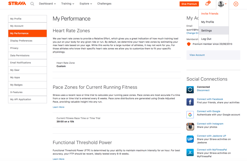
In order to make the most of the Fitness and Freshness charts, it is important that you use an accurate current figure for your Functional Threshold Power. The best way to do this is to go and do a power test. It is preferable to follow a formal protocol that you can repeat, such as that suggested by British Cycling. Alternatively, Strava premium users can refer to the Strava Power Curve. You can either take your best effort over 1 hour or 95% of your best effort over 20 minutes. Or you can click on the “Show estimated FTP” button  and take the lower figure. In order for this to flow through into your Fitness and Freshness chart, you need to enter your 1 hour FTP into your personal settings, under “My Performance”.

Screen Shot 2018-05-08 at 15.14.00

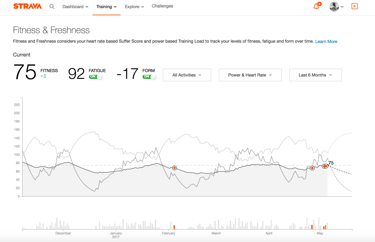
The example chart at the top of this blog shows how my season has panned out so far. After taking a two week break before Christmas, I started a solid block of training in January. My recovery week was actually spent skiing (pretty hard), though this did not register on Strava because I did not use a heart rate monitor. So the sharp drop in fatigue at the end of January is exaggerated. Nevertheless, my form was positive for my first race on 4 February. Unfortunately, I was knocked off and smashed a few ribs, forcing me to take an unplanned two week break. By the time I was able to start riding tentatively, rather than starting from an elevated level, my fitness had deteriorated to December’s trough.

After a solid, but still painful, block of low intensity training in March, I took another “recovery week” on the slopes of St Anton. I subsequently picked up a cold that delayed the start of the next block of training, but I have incorporated some crit races into my plan, for higher intensity sessions. If you edit the activity and make the “ride type” a “race”, it shows up as a red dot on the chart. Barring accident and illness, the hope is to stick more closely to a planned four-week cycle going forward.

This demonstrates how Strava’s tools reveal the real-life difficulties of putting the theoretical benefits of periodisation into practice.

Related posts

Modelling Strava Fitness and Freshness

Supercompensating with Strava

See other blogs on Strava Power Curve, Strava Ride Statistics or going for a Strava KOM.

Strava Ride Statistics

If you ride with a power meter and a heart rate monitor, Strava’s premium subscription will display a number of summary statistics about your ride. These differ from the numbers provided by other software, such as Training Peaks. How do all these numbers relate to each other?

A tale of two scales

Over the years, coaches and academics have developed statistics to summarise the amount of physiological stress induced by different types of endurance exercise. Two similar approaches have gained prominence. Dr Andrew Coggan has registered the names of several measures used by Training Peaks. Dr Phil Skiba has developed as set of metrics used in the literature and by PhysFarm Training Systems. These and other calculations are available on Golden Cheetah‘s excellent free software.

Although it is possible to line up metrics that roughly correspond to each other, the calculations are different and the proponents of each scale emphasise particular nuances that distinguish them. This makes it hard to match up the figures.

Here is an example for a recent hill session. The power trace is highly variable, because the ride involved 12 short sharp climbs.

Metric Coggan TrainingPeaks Skiba Literature Strava
Power equivalent physiological cost of ride Normalised Power 282 xPower 252 Weighted Avg Power 252
Power variability of ride Variability Index 1.57 Variability Index 1.41
Rider’s sustainable power Functional Threshold Power 312 Critical Power 300 FTP 300
Power cost / sustainable power Intensity Factor 0.9 Relative Intensity 0.84 Intensity 0.84
Assessment of intensity and duration of ride Training Stress Score 117 BikeScore 101 Training Load 100
Training Impulse based on heart rate Suffer Score 56

Weighted Average Power

According to Strava, Weighted Average Power takes account of the variability of your power reading during a ride. “It is our best guess at your average power if you rode at the exact same wattage the entire ride.” That sounds an awful lot like Normalized Power, which is described on Training Peaks as “an estimate of the power that you could have maintained for the same physiological “cost” if your power output had been perfectly constant (e.g., as on a stationary cycle ergometer), rather than variable”. But it is apparent from the table above that Strava is calculating Skiba’s xPower.

The calculations of Normalized Power and xPower both smooth the raw power data, raise these observations to the fourth power, take the average over the whole ride and obtain the fourth root to give the answer.

Normalized Power or xPower = (Average(Psmoothed4))1/4

The only difference between the calculations is the way that smoothing accounts for the body’s physiological delay in reacting to rapid changes in pedalling power. Normalized Power uses a 30 second moving average, whereas xPower uses a “25 second exponential average”. According to Skiba, exponential decay is better than Coggan’s linear decay in representing the way the body reacts to changes in effort.

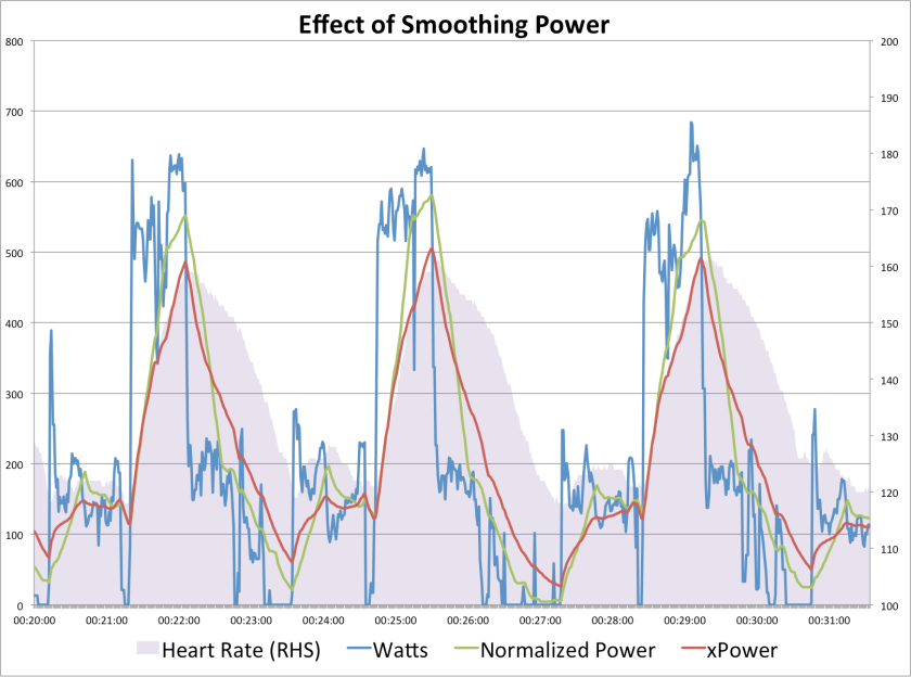
The following chart zooms into part of the hill reps session, showing the raw power output (in blue), moving average smoothing for Normalised Power (in green), exponential smoothing for xPower (in red), with heart rate shown in the background (in grey). Two important observations can be made. Firstly, xPower’s exponential smoothing is more highly correlated with heart rate, so it could be argued that it does indeed correspond more closely with the underlying physiological processes. Secondly, the smoothing used for xPower is less volatile, therefore xPower will always be lower than Normalized Power (because the fourth-power scaling is dominated by the highest observations).

Power

Why do both metrics take the watts and raise them to the fourth power? Coggan states that many of the body’s responses are “curvilinear”. The following chart is a good example, showing the rapid accumulation of blood lactate concentration at high levels of effort.

Screen Shot 2017-04-20 at 15.08.31

Plotting the actual data from a recent test on a log-log scale, I obtained a coefficient of between 3.5 and 4.7, for the relation between lactate level and watts. This suggests that taking the average of smoothed watts raised to the power 4 gives an indication of the average level of lactate in circulation during the ride.

The hill reps ride included multiple bouts of high power, causing repeated accumulation of lactate and other stress related factors. Both the Normalised Power of 282W and xPower of 252W were significantly higher than the straight average power of 179W. The variability index compares each adjusted power against average power, resulting in variability indices of 1.57 and 1.41 respectively. These are very high figures, due to the hilly nature of the session. For a well-paced time trial, the variability index should be close to 1.00.

Sustainable Power

It is important for a serious cyclist to have a good idea of the power that he or she can sustain for a prolonged period. Functional Threshold Power and Critical Power measure slightly different things. The emphasis of FTP is on the maximum power sustainable for one hour, whereas CP is the power theoretically sustainable indefinitely. So CP should be lower than FTP.

Strava allows you to set your Functional Threshold Power under your personal performance settings. The problem is that if Strava’s Weighted Average Power is based on Skiba’s xPower, it would be more consistent to use Critical Power, as I did in the table above. This is important because this figure is used to calculate Intensity and Training Load. If you follow Strava’s suggestion of using FTP, subsequent calculations will underestimate your Training Load,  which, in turn, impacts your Fitness & Freshness curves.

Intensity

The idea of intensity is to measure severity of a ride, taking account of the rider’s individual capabilities.  Intensity is defined as the ratio of the power equivalent physiological cost of the ride relative to your sustainable power. For Coggan, the Intensity Factor is NP/FTP; for Skiba the Relative Intensity is xPower/CP; and for Strava the Intensity is Weighted Average Power/FTP.

Training Load

An overall assessment of a ride needs to take account of the intensity and the duration of a ride. It is helpful to standardise this for an individual rider, by comparing it against a benchmark, such as an all-out one hour effort.

Coggan proposes the Training Stress Score that takes the ratio the work done at Normalised Power, scaled by the Intensity Factor squared, relative to one hour’s work at FTP. Skiba defines the BikeScore as the ratio the work done at xPower, scaled by the Relative Intensity squared, relative to one hour’s work at CP. And finally, Strava’s Training Load takes the ratio the work done at Weighted Average Power, scaled by Intensity squared, relative to one hour’s work at FTP.

Note that for my hill reps ride, the BikeScore of 101, was considerably lower than the TSS of 117. Although my estimated CP is 12W lower than my FTP, xPower was 30W lower than NP. Using my CP as my Strava FTP, Strava’s Training Load is the same as Skiba’s Bike Score (otherwise I’d get 93).

Suffer Score

Strava’s Suffer Score was inspired by Eric Banister’s training-impulse (TRIMP) concept. It is derived from the amount of time spent in each heart rate zone, so it can be calculated for multiple sports. You can set your Strava heart rate zones in your personal settings, or just leave then on default, based on your maximum heart rate.

A non-linear relationship is assumed between effort and heart rate zone. Each minute in Zone 1, Endurance, is worth 12 seconds; Moderate Zone 2 minutes are worth 24 seconds; Zone 3 Tempo minutes are worth 45 seconds; Zone 4 Threshold minutes are worth 100 seconds; and Anaerobic Zone 5 minutes are worth 120 seconds. The Suffer Score is the weighted sum of minutes in each zone.

The next blog will comment on the Fitness & Freshness charts available on Strava Premium.

Pro Cyclist KOMs on Strava

This series has explored what it takes to get a KOM on Strava, but what about the pros? Don’t they come home with a sackful of KOMs after every training ride? Which pro rider tops the most Strava leaderboards?

You can follow over a thousand pro athletes on Strava. These include runners, triathletes, mountain bikers and professional cyclists. Although you will not find Peter Sagan, Chris Froome, Nairo Quintana or Alberto Contador  (you can ignore all the fake Strava ids with these names), there is a good selection of UCI team riders. There are also riders who do not claim Strava pro status, like some guy called Phil who recently went out for an afternoon ride.

Some pros upload just a limited number of rides, for example, Marianne Vos only has 243 rides on Strava, with nothing new since December. Other riders, such as Ian Stannard, upload their rides, but withhold their (monstrously high) power data. Nevertheless, many pro riders are more open about making their data available on Strava, including power. Take a look at the Col d’Eze segment on the final stage of Paris Nice. The little lightning bolt symbol indicates that the rider was using a power meter, but rather confusingly, some pro riders (Team Sky) are able to hide their average power for the ride, in which case the figure is a Strava estimate. But you can find the real number by highlighting the segment in the analysis view of the ride.

This review considers over 200 active professional road cyclists who are on Strava. The riders with the highest number of KOMs need to have uploaded a lot fast rides, in regions where many segments have been recorded. Here are the current top 10 pro riders from the sample.

Rank KOMs Name Team
1 1907 Laurens ten Dam Team Sunweb
2 1381 Elisa Longo Borghini Wiggle Honda
3 1296 Annemiek van Vleuten Orica AIS
4 1230 Niki Terpstra Racing Quick-Step Floors
5 1162 James Gullen JLT Condor
6 1070 Thibaut Pinot FDJ
7 1035 Dan Evans Cannodale-Drapac Pro Cycling Team
8 978 Romain Bardet AG2R
9 864 Joe Dombrowski Cannodale-Drapac Pro Cycling Team
10 852 Dani King Cylance

A bit further down the list, Michal Kwiatkowski has 559 KOMs, including eight that he picked up in his Milan San Remo victory. After riding the first 140km at a relatively easy 35kph and an average power of just 124W, he upped the effort to traverse the Passo del Turchino. His power and heart rate rose progressively all the way to the Cipressa, from which point he earned a KOM for the segment to the finish. He claimed four KOMs as he followed Peter Sagan’s dramatic attack on the Poggio, though these would have undoubtably been Sagan’s, if he’d put his data on Strava. Viewing the ride analysis, we see that after over seven hours of riding, Michal ascended the 3.6km 4% climb at 37kph, generating 443W (about 6.5 W/kg) for 5 minutes and 47 seconds, rather than the 536W estimated on the leaderboard. He peaked at over 900W near the summit as he an Alaphilippe desperately fought to get onto Sagan’s wheel.Lauren ten Dam has the most KOMs by a long way, though he does match Maryka Sennema’s haul of QOMs. Interestingly there are three women in the top ten, in spite of the fact that most of the riders in the sample were men. It is no surprise to see Elisa Longo Borghini and Annemiek van Vleuten at the head of the women’s rankings. Niki Terpstra follows his Dutch compatriot, while James Gullen is the leading Brit, followed by Dan Evans representing Wales alongside Dani King. Thibaut Pinot and Romain Bardet are the kings of the French mountains. Nice-based American rider Joe Dombrowski also makes the top ten.

The next blog will explore some more feats of the professionals.

Going for a QOM on Strava

In exploring how to chase a KOM on Strava, this series of articles has fallen into the trap of under-representing the achievements of the Queens of the Mountains (QOMs). Although this is partly because Strava tends to attract male data geeks, there are plenty of women who use the platform to monitor their fitness and performance in a social way. This blog looks at the performance of women cyclists, once again featuring the popular Tour de Richmond Park segment.

More women are riding their bikes as the interest in women’s cycling continues to grow. Top riders like Lizzie Deignan, Marianne Vos and the Drops Cycling Team are receiving broader recognition for their amazing performances. This year’s Women’s Tour will benefit from broad media coverage, as it finishes in the heart of London. The Cycling Podcast Féminin is now into its ninth episode.

Analysis of the top 1000 (mostly male) riders on the Tour de Richmond Park leaderboard established that the majority of personal bests (PBs) were set during the summer months, either early in the morning or in the evening, with Saturday and Wednesday being popular days or the week, especially when the wind was blowing from the East. The charts below compare these statistics from the male and female leaderboards.

This slideshow requires JavaScript.

Female PBs are a little more evenly spread over the year, peaking in July. Women have tended to achieve their best times later in the morning, perhaps reflecting a stronger preference for cycling around the park on the weekend, particularly on Sunday, when men seem to be off chasing KOMs elsewhere.

An Easterly wind has also been helpful, though the effect has been less marked than for the men. In fact only three out of the top 25 women benefited from a favourable wind direction. This suggests that, as the weather warms up, there’s an opportunity to post a very good time when there is a strong tailwind up Sawyers Hill, perhaps seeing the first woman under sixteen minutes for the segment. So watch the forecast and get out there girls!

The last post noted that riders can be classified according to their strengths as sprinters, climbers or time trialers. Whatever kind of rider you are, it is important to balance dietary energy intake with exertion. Given the non weight-bearing nature of the sport, this is particularly important for very lean female cyclists, who may experience disruption of hormonal function, resulting in reduced bone mineral density. See Nicky Keay’s blog for more information on Relative Energy Deficiency in Sport, which is also relevant to men and young athletes.

No discussion of Strava QOMs could fail to mention the incredible performance of Maryka Sennema. Her dedication to training and cycling at the highest level has earned her over 2,200 QOMs, making her the undisputed Goddess of the Mountains.

The next blog will continue to apply the scientific microscope to cycling data, in search of helpful insights on pro cyclists.

The best rider for a Strava KOM

So far this series of article has explored to the time of year, wind and weather conditions when riders have set their best times on the Strava leaderboard, using the popular Tour of Richmond Park segment as a case study. This blog considers how the attributes of the cyclist affect the time to complete a segment. The most important components are power, bodyweight and aerodynamic drag area or CdA. Your best chance of picking up a KOM is to target a segment that matches your strengths as a cyclist.

A power curve plots the maximal power a cyclist can sustain over a range of time periods. Ideally, the curve is plotted from the results of a series of maximal effort tests performed over times ranging from 5 seconds to an hour. Alternatively, Strava Premium or software such as Training Peaks or Golden Cheetah can generate power curves from a history of power data files. Power can be expressed in Watts or in Watts per kilogram, as in the example below.

GC_PowerCurve

The shape of the power curve reveals a lot about the characteristics of the cyclist. Dr Andrew Coggan explains how this information can be used to define a cyclist’s individual power profile. In the chart above, the 5 minute and functional threshold (1 hour) Watts/kg rank more highly than 5 second and 1 minute figures, indicating that this cyclist can generate fairly high power for long periods, but has a relatively weaker sprint. For a heavier rider this profile would be consistent with a time trialer, who can generate a high absolute number of Watts, whereas a light rider with this profile may be a better climber, due to a good sustainable power to weight ratio.

If you have a power meter or access to a Wattbike, it is well worth gathering this data for yourself. It can help with training, racing or selecting Strava segments where you have the best chance of moving up the leaderboard.

The power required to maintain a constant speed, V,  needs to balance the forces acting on a rider. Aerodynamic drag is due to the resistance of pushing the rider and bike frame through the air, with some additional drag coming from the rotating wheels. Drag can be decreased by reducing frontal area and by adopting a streamlined shape, while wearing a skinsuit. Additional mechanical factors are due to gravity, the rolling resistance of the tyres on the road surface and drive chain loss.

Power = Drag Factors * V3 + Mechanical Factors * V

Since the power needed to overcome aerodynamic drag scales with the cube of velocity, it is the dominant factor when riding fast on flat or downhill segments. However, on a climb, where speed is lower, the power required to do work against gravity quickly becomes important, especially for heavier riders.

Consider a rider weighing 60kg, call him Nairo, and another weighing 80kg, say Fabian. Suppose they are cruising along side by side at 40kph. Under reasonable assumptions, Fabian rides at 276 Watts or 3.4 Watts/kg, while Nairo benefits from a smaller frontal area and lower rolling resistance, requiring 230 Watts, though this equates to 3.8 Watts/kg. Reaching a 5% hill, they both increase power by 50%, but now Nairo is riding at 27kph, dropping Fabian, whose extra weight slows him to 26kph. You can experiment with this interactive chart.

Climbers are able to sustain high force on the pedals, taking advantage of their ability to accelerate quickly on the steepest slopes. Time trialers generate high absolute power for long periods, on smoother terrain, while maintaining an aerodynamic tuck. Sprinters have more fast-twitch muscle fibres, producing extremely high power for short periods, while pedalling at a rapid cadence.

The following chart shows the gradient and length of 1364 popular Strava segments from around Britain. Distances range from 93m to 93km, with an average of 2.3km. Gradients are from 21% downhill to 32% uphill (Stanwix Bank Climb).

Plot 22
You should be able to click on the chart (no need to sign up) for an interactive version that allows you to zoom in and display the names of the segments that suit your ability: short segments for sprinters, steep ones for climbers and longer flat ones for TTers. The Tour de Richmond Park segment is 10.8km with an average gradient of zero, so it is no surprise that the KOM is held by an accomplished time trialer.
The next blog takes a look at QOMs. Are women different?