Data Science is a hot topic that is impacting a range of diverse areas from business to sport. With so many cyclists collecting and uploading their data, there is plenty of raw material from which to draw interesting insights. This is the first in a series of articles exploring applications of data science in the field of cycling, beginning with the concept of clustering.
As a data set, I took all my Garmin files covering 2014-2017. Having previously uploaded them onto Golden Cheetah (GC), I took advantage of the API that allows external programmes, such as Python, to retrieve data. I also used a Python library to download the same rides from Strava, where I had recorded additional information about the rides.
After a certain amount of (rather time-consuming) tidying up, I ended up with over 800 rides. Each ride had over 200 summary statistics calculated by GC, as well as other meta-data, such as whether the ride was a race or turbo session. The metrics included all the standard items, such as time, distance, speed, heart rate, power, elevation gain, TSS, normalised power, as well as more esoteric metrics like “Time expended when Power is above CP and W’ bal is between 50% and 75% of W'”. When each ride is represented by a point in 200-dimensional space, it is easy to be overwhelmed. As a coach or an informed rider, which metrics are the most meaningful? This is precisely where data science steps in.
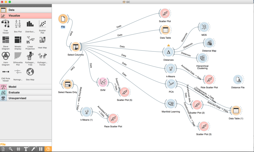
I decided to use some open source machine learning and data visualisation software called Orange. This makes it very straightforward to set up simple pipelines using a toolbox of standard approaches, as illustrated above.
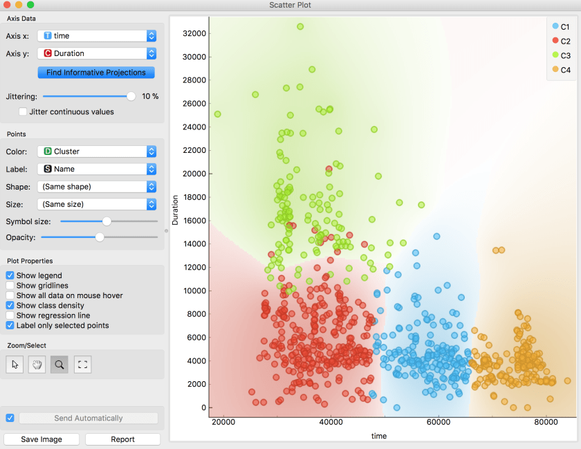
One of the first things to do was to ask the computer to look for clusters of rides with similar characteristics. Orange has a useful feature that finds informative projections of the data that can be displayed on a scatter plot. As a first cut, the K-means algorithm categorised the data into four clusters that were largely explained by the time of day and the duration of the ride.
Duration of ride (in seconds) versus Time of day (seconds since midnight)
Although this makes a pretty graph, it simply tells us that I start a lot of rides in the morning, but do quite a few in the afternoon and evening. The green cluster includes my longer rides that rather obviously have to start earlier in the day. The scale is annoyingly shown in seconds, so a duration of 1800 would be a five hour ride. The blue band runs from about 1:30pm to about 6:30pm.
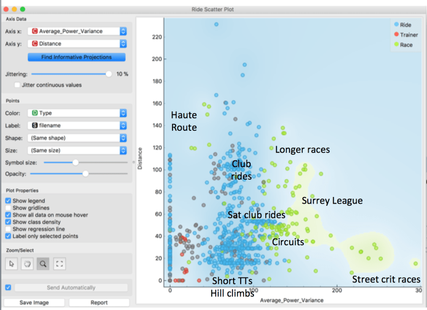
Grouping rides by time of day was not very helpful, so I filtered out that variable and searched again for rides that were similar in terms of effort. This made the results much more interesting. Distance and Average Power Variance (APV) were among the most informative metrics. The following scatter plot does a very good job of separating out races (shown in green), from normal rides and turbo trainer sessions (red). The points I did not have time to label are shown in grey.
Average Power Variance measures the mean power deviation with respect to its 30 second moving average. This will be high when power output is continually changing sharply, as it does on very short town centre courses or the Crystal Palace loop, where you are repeatedly sprinting out of corners. When racing on the Hillingdon and Dunsfold circuits or longer Surrey League routes, power is still much more variable than on a club ride. The band of Saturday club riders is very obvious at 53km: four laps of Richmond Park, with varying levels of APV depending on how aggressively the group was riding. You can also see that I quite often do only one or two laps, at about 19km and 30km. Short TTs and hill climb races tend to have less power variability. This was also the case on the endlessly long climbs encountered on the Haute Route. Lastly, turbo sessions have much lower APV because, even if target power levels vary, they tend to be sustained at the same level for each segment.
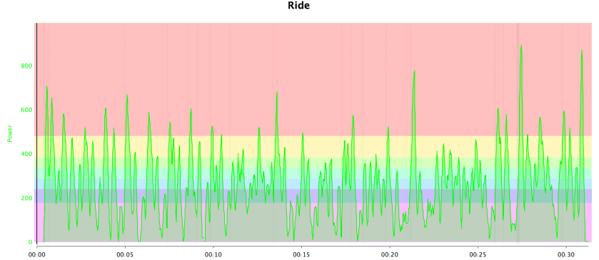
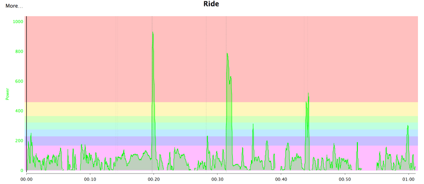
It is worth noting that APV is not correlated with the Variability Index, which is the ratio of normalised power to average power. APV is affected by continual changes in power output, whereas the Variability Index is strongly affected by power peaks, even if they a relatively few. The two power files below illustrate the difference.
Crit race: High APV Low VIThree sprints: Low APV High VI
Conclusions
This analysis draws attention to Average Power Variance as a useful metric that is high for circuit and road races, but lower for TTs and long hilly races. The key observation for me is that relatively little of my training has a high APV.
The next part in this series zooms in on the races, to identify metrics associated with good and bad results.


One thought on “Cycling Data Science – clusters”