Chemical composition of a bicycle

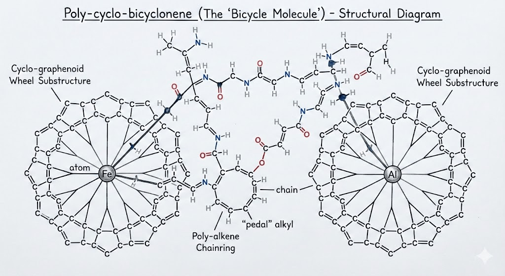
A high-performance bicycle relies of a mix of advanced polymer science an metallurgy. Carbon only makes up about the half the mass of a carbon-framed bike. The moving components include iron, aluminium and specialist alloys. The frame is held together with epoxy resins and the tyres include a range of compounds to reduce rolling resistance, while maintaining grip. I wondered, what is the chemical composition of my bicycle? Where do these chemicals come from?

Canyon frameset and deep-section wheels

The primary materials of the frame and rims are carbon fibre and epoxy resin. High-end frames and rims use “pre-preg” carbon filaments held together by a thermosetting resin matrix. Carbon fibre is roughly 95% elemental carbon. It is created by heating precursor fibres until only carbon remains in a hexagonal crystalline structure. Epoxy resin is polymer typically derived from carbon, hydrogen and oxygen. It provides the compressive strength that keeps the carbon fibres in shape.

Estimated Mass: ~2.8 kg (Frame, Fork, Rims).

Elemental makeup: ~80% Carbon, ~12% Oxygen, ~7% Hydrogen, ~1% Nitrogen.

Shimano Ultegra drivetrain

The drivetrain is made out of aluminium alloys, stainless steel and small amounts of titanium/chrome. The cranks and hubs require high-strength aluminium alloys that include zinc and magnesium to prevent fatigue. The cassette and chain are mostly chromium-steel. The chain requires high tensile strength and wear resistance, achieved through iron alloyed with carbon and chromium. Bearings are steel (iron/chromium) or occasionally ceramic (silicon nitride).

Estimated Mass: ~2.6 kg.

Elemental makeup: ~65% Iron, ~30% Aluminium, ~3% Chromium, ~2% Zinc/Magnesium/Others.

Continental GP5000 Tyres

Tyres are made from synthetic/natural rubber, silica and carbon black, a reinforcing agent. The GP5000 is famous for its “Black Chili” compound. Unlike older tyres that relied heavily on carbon black, modern high-performance tyres use a high percentage of silica to reduce rolling resistance while maintaining grip. The casing is usually nylon (polyamide), consisting of carbon, nitrogen, oxygen and hydrogen. The bead is often Kevlar (aramid), which is another nitrogen-rich polymer.

Estimated Mass: ~0.5 kg (for the pair).

Elemental makeup: ~60% Carbon, ~20% Silicon, ~10% Oxygen, ~5% Sulphur (used in vulcanization), ~5% Hydrogen/Nitrogen

Total Elemental Breakdown (By Mass)

This table estimates the elemental distribution for a complete 8,000g (8kg) bike. These figures are calculated based on the average weight of the components listed above.

ElementEstimated Mass (g)% of TotalPrimary Source
Carbon3,840g48.0%Frame, wheels, tyres, resins, saddle
Iron1,760g22.0%Chain, cassette, spokes, bearings, bolts
Aluminium1,440g18.0%Crankset, hubs, stem, bars, calipers
Oxygen400g5.0%Epoxy resins, rubber compounds, paint
Hydrogen240g3.0%Polymer chains in resins and plastics
Silicon120g1.5%Tyre compound (Silica), lubricants
Chromium80g1.0%Stainless steel hardening (Drivetrain)
Nitrogen40g0.5%Nylon tyre casing, Kevlar beads
Sulphur40g0.5%Vulcanising agent in tyres and tubes
Others (Zn, Mg, Ti, Cu)40g0.5%Aluminium alloying and specialty bolts
Total8,000g100%

Where do these elements come from?

A fascinating paper by Craig Tindale, “The Return of Matter”, provides a sobering perspective on the dependency of manufacturers on the dirty and energy-intensive business of refining, purifying and separating the elements required for modern engineering and technology. While a Canyon bikes are designed in Germany and its Shimano components are engineered in Japan, the material reality of the bike is heavily dependent on Chinese industrial processing to turn the raw ore into high-purity metals and polymers.

Here is how this bike’s elemental components are tied to Chinese supply chains:

1. Carbon (48.0% of Mass)

Component: Frame, Wheels, Resins.

Dependency: High.

While the article focuses on metals, it notes that China has spent decades building the “processing sovereignty” required for advanced materials. High-modulus carbon fibre and the epoxy resins that bind them are part of a complex polymer supply chain where China acts as a global gatekeeper. Even if the precursor chemicals are sourced elsewhere, the massive scale of carbon fibre “midstream” production is increasingly concentrated in China.

2. Iron/Steel (22.0% of Mass)

Component: Chain, Cassette, Spokes, Bearings.

Dependency: Total.

Tindale describes an “Iron Ore Stranglehold”. Even though Western majors like BHP and Rio Tinto mine the ore, it is shipped as concentrate directly to Chinese smelters. The steel in your Ultegra cassette is likely refined in a Chinese furnace that sets the global “tempo of Western inflation” and availability.

3. Aluminium (18.0% of Mass)

Component: Crankset, Hubs, Cockpit.

Dependency: Extreme (60% share).

China controls approximately 60% of global aluminium smelting. Furthermore, high-performance aluminium (like the 7000-series in your cranks) requires magnesium for hardening. China controls 90–95% of global magnesium smelting. Without Chinese magnesium, your bike’s aluminium components would lack the fatigue resistance necessary for racing.

4. Silicon (1.5% of Mass)

Component: Tires (Silica), Lubricants.

Dependency: Dominant (95% share).

The refining of silicon is a massive Chinese monopoly; they control 95% of the world’s polysilicon capacity. While your tyres use silica , the high-purity chemical processing required for the “Black Chili” compound sits firmly behind what Tindale calls China’s “lattice of chemical plants”.

5. Chromium & Others (Mg, Ti, Cu) (2.0% of Mass)

Component: Stainless steel, Alloying, Bolts.

Dependency: Structural (The “Derivative Mineral Trap”).

Titanium is used in high-end bolts and derailleur parts. China and Russia control 75% of global titanium sponge capacity. The US has only one domestic plant, leaving bike manufacturers with almost no non-adversarial choice for titanium. Chromium and other alloy ingredients are often recovered as “hitchhikers” during the smelting of host metals. Since China dominates base metal smelting (e.g., 50% of copper), it essentially “inherits” the critical by-products needed to harden your bike’s drivetrain.

Summary: The “Bicycle Trap”

You might “own” the bike, while Canyon and Shimano might “own” the design, but the kinetic power—the ability to actually build the machine—belongs to whoever owns the refineries. If China were to tighten export controls, as it has recently done for antimony (ammunition) and tungsten (munitions), the production of high-performance bikes would likely experience a “forced regression in engineering capabilities”, where manufacturers would have to substitute inferior, heavier materials for the refined ones they can no longer access.

Human Blood Protein Atlas

A recent report in Science announced the publication of a new human blood protein atlas, describing the disease signatures of thousands of proteins circulating in the blood. Minimally invasive protein profiling marks a step forward in the personalisation of medicine. Some interesting statistical and machine learning techniques were employed.

Blood Protein Study

The researchers’ methods included a technique called proximity extension assay (PEA), which makes use of highly specific probes of DNA strands to detect minute concentrations of proteins in the blood plasma. Amplification with PCR (Polymerase Chain Reactions) allowed 5,416 proteins to be evaluated.

A longitudinal dataset showed dramatic changes as children passed through adolescence to adulthood. The central part of the study was a cross-sectional analysis, where age, sex and BMI were identified as important explanatory factors. The signatures of 59 clinically relevant diseases, in seven classes, can be viewed interactively in The Human Protein Atlas.

Into the secretome

Rather than the hideaway of a reclusive cockney, the secretome refers to the ensemble of secreted proteins. From a data science perspective, the challenge was how to find the signatures of a wide range of diseases, based on the differential abundance of over 5,400 proteins. This was complicated by the fact that many proteins elevated by a particular disease were also found to be elevated in other diseases.

“To investigate the distinct and shared proteomics signatures across diseases, we performed differential abundance analyses. Several groups were used as controls, including healthy samples, a disease background consisting of all other diseases, and samples from the same disease class.”

From The Human Protein Atlas

The differential abundance of proteins was evaluated using normalised protein expression units (NPX). The volcano chart above plots the p-values against the multiplicative (fold) change in NPX, both on log scales. The red values on the right were unusually high and the blue values on the left was exceptionally low.

The researchers used a logistic LASSO approach to identify the importance of proteins in providing a signature of each disease against its cohort. In the case of HIV above, CRTAM was the most significant explanatory factor, even though CD6 had the most extreme p-value.

How does logistic LASSO work?

A logistic model is trained on target values of one or zero, in this case representing the presence or absence of a disease. Least absolute shrinkage and selection operator (LASSO) is a version of linear regression that selects the most relevant explanatory variables using L1 regularisation. Adding the sum of the absolute values of the regression coefficients to the objective function forces the contribution of irrelevant variables towards zero as the hyper-parameter, λ, is increased. This property was particularly useful for the disease signature problem, where there were thousands of potential explanatory proteins.

The tricky aspect of LASSO is tuning the hyper-parameter, λ. You want it to be high enough to eliminate irrelevant variables, but not so high that it discounts the useful explanatory features. In the protein study, this was addressed using cross-validation: randomly splitting the data into 70:30 training and test sets, then rerunning the regression for a range of λ values. The quality of a model can be assessed in terms of both its accuracy and its required number of inputs, using criteria such as the Akaike information criterion or Bayesian information criterion, which favour parsimony. Repeating the randomisation 100 times, the researchers could home in on an optimal value of λ. The regression coefficients of the resulting model could then be used to rank the importance of the relevant proteins, as shown in the right hand side of the panel above.

Personalised health

The potential for a cheap, annual blood test to screen the whole population is immense. Proteomics adds to the arsenal of resources available to help people stay healthy. Early indications of diseases like cancer can be critical in initiating treatment. There is plenty of room to broaden the scope beyond the current 59 diseases, to include rarer conditions, such as Motor Neurone Disease, which has impacted some top sportsmen. It would be extremely helpful to find proteins related to the apparent epidemic of mental health issues, which are hard to define and lack objective, quantitative diagnostic criteria.

Round Britain By Bike

This morning I cheered on Bernard Bunting as he embarked on an epic tour Round Britain By Bike to raise money for the Rare Dementia Support Centre.

Bernard has set himself the impressive target of riding around the coastline of Britain. He will start and end at Putney Bridge in London, visiting 50 checkpoints along the way. This involves some serious route planning. The problem reminded me of the famous Travelling Salesmen Problem, where the challenge is to find the shortest route that visits each of a list of cities and returns to the starting point.

Bernard’s Checkpoints

Travelling Salesman Problem

Apart from cycling around Britain, the Travelling Salesman Problem is relevant in to circumstances, such as scheduling the order of supermarket deliveries or planning logistics for manufacturing processes. The problem is considered to be NP-hard, meaning that the number of combinations explodes exponentially as the number of cities increases. For example, considering only the order in which he passes the checkpoints, Bernard could set off for any of 49 destinations, then choose to go to any of 48 places, then one of the remaining 47 … before eventually returning to Putney Bridge, resulting in 49! (approximately 6.1 x 1062) possible routes. This makes it very hard to be absolutely sure that any particular route is the shortest. For most problems the best you can do is come up with a fairly good route.

Elastic band – a greedy approach

I have always imagined a quick way to find a reasonably good approach is to visualise the cities marked with pins on a map. You start by putting an elastic band around the outside (a convex hull). Then you consider all the points inside the band and pull the elastic in around the closest point. Repeat until you have all the points. This is approach is “greedy” in the sense that it only looks one step ahead when choosing the best option. It starts slowly, but gets faster as the number of remaining points is reduced.

Greedy elastic band algorithm for a route around Britain

Tweaking it

One problem with the simple greedy approach is that it sometime produces a path that crosses itself. This is inefficient because it is alway an uncrossed path as always shorter. Although it is very easy to spot a crossed path, writing an algorithm that makes sure no path crosses any other is quite time-consuming. A simpler approach is to step around the current route and reuse the original trick of finding the closest point to each edge. If it is better to divert to that point, update the route. Repeat until no improvements are found. Tweaking the route around Britain slightly reduced the overall length.

This is the tweaking process running on a more complicated problem involving 300 checkpoints. Once the initial route is built, the tweaking process reduces the path length from 15.01 to 14.44. Python code can be found on GitHub in my TSP repository.

Getting real

Although tweaking the result shortened the route around the 50 British checkpoints, it does not follow the coastline and it jumps directly from St Ives to Johnston in Wales. So this solution is not particularly useful for Bernard’s planning. Practical route finding must take account of roads and physical barriers.

Fortunately Bernard will be following his GPS route on his bike computer. He also has a printed card for each day. Let’s hope he doesn’t get lost.

You can follow Bernard on Strava and news will be posted on his website. Please consider supporting Bernard by making a donation.

How many heartbeats?

AI-generated by Picsart

The fascinating work of Geoffrey West explores the idea of universal scaling laws. He describes how the lifetimes of organisms tend to increase with size: elephants live longer than mice. On the other hand, average heart rate tends to decrease with size. It turns out that these two factors balance each other in such as way that over their lifetimes, elephants have roughly the same number of heartbeats as mice and all other animals: about 1.5 billion.

Less active people might be tempted to suggest that indulging in exercise reduces our lifetimes, because we use up our allocation of heartbeats more quickly. However, exercisers tend to have a lower resting heart rate than their sedentary peers. So if we really had a fixed allocation of heartbeats, would we be better off exercising or not?

Power laws

To get a sense of how things change with scale, consider doubling the size of an object. Its surface area goes up 4 times (2 to the power of 2), while its volume and its mass rise 8 times (2 to the power of 3). Since an animal loses heat through its skin whereas its ability to generate heat depends on its muscle mass, larger animals are better able to survive a cold winter. This fact led some scientists to suspect that metabolism should be related to mass raised to the power of 2/3. However, empirical work by Max Klieber in the 1930s found a power exponent of 3/4 across a wide range of body sizes.

Geoffrey West went on to explain the common occurrence of the 1/4 factor in many power laws associating physiological characteristics with the size of biological systems. His work suggests that this is because, as they evolved, organisms have been subject to the constraints of living in a 3-dimensional world. The factor, 4, drops out of the analysis, being one more than the number of dimensions.

Two important characteristics are lifetime, which tends to increase in relation to mass raised to the power of 1/4, and heart rate, which is associated with mass raised to the power of -1/4. If you multiply the two together to obtain the total number of heartbeats, the 1/4 and the -1/4 cancel each other out, leaving you with a constant of around 1.5 billion. 

Human heart beats

According to the NHS, the normal adult heart rate while resting is 60 to 100 bpm, but fitter people have lower heart rates, with athletes having rates of 40 to 60 bpm. Suppose we compare Lazy Larry, whose resting heart rate is 70bpm, with Sporty Steve, who has the same body mass, but has a resting heart rate of 50bpm.

Let’s assume that as Larry eats, drinks coffee and moves around, his average heart rate across the day is 80bpm. Steve carries out the same activities, but he also follows a weekly training plan of that involves periods of elevated heart rates. During exercise Steve’s heart beats at 140bpm for an average of one hour a day, but the rest time it averages 60bpm.

If Larry expects to live until he is 80, he would have 80*60*24*365*80 or 3.36 billion heart beats. This is higher than West’s figure of 1.5 billion, but before the advent of modern hygiene and medicine, it would not be unusual for humans to die by the age of 40.

Exercise is good for you

The key message is that, accounting for exercise, Steve’s average daily heart rate is (140*1+60*23)/24 or 63bpm. The benefits of having a lower heart rate than Larry easily offset the effects of one hour of daily vigorous exercise.

Although it is a rather silly exercise, one could ask how long Steve would live if he expected the same number of heartbeats as Larry. The answer is 80/63 times longer or 101 years. So if mortality were determined only by the capacity of the heart to beat a certain number of times, taking exercise could add 21 years to a lifetime. Before entirely dismissing that figure, note that NHS data show that ischaemic heart disease remains one of the leading causes of death in the UK. Cardiac health is a very important aspect of overall health.

Obviously many other factors affect longevity, for example those taking exercise tend to be more aware of their health and are less likely to suffer from obesity, smoke, consume excessive alcohol or eat ultra-processed foods.

A study of 4,082 Commonwealth Games medallists showed that male athletes gained between 4.5 and 5.3 extra years of life and female athletes 3.9. Although cycling was the only sport that wasn’t associated with longer lives, safety has improved and casualty rates have declined over the years.

Exercise, good nutrition and sufficient sleep are crucial for health and longevity. There’s no point in waiting until you are 60 and taking elixirs and magic potions. The earlier in life you adopt good habits, the longer you are likely to live.

Closing the gap

Artwork: David Mitchell

One of the big differences between amateur and professional cycle racing is the role of the breakaway. Amateur racing usually consists of a succession of attacks until a group of strong riders breaks away and disappears into the distance to contest the win. There is rarely enough firepower left in the peloton to close down the gap.

This contrasts with professional racing, where a group of weaker riders typically contests for the breakaway, hoping that the pursuing teams will miscalculate their efforts to bring their leaders to the head of the race in the final kilometres. Occasionally a solo rider launches a last minute attack, forcing other riders to chase.

One minute for every ten kilometres

Much of the excitement for cycling fans is generated by the tension between the breakaway and the peloton, especially when the result of the race hangs in the balance until the final metres. Commentators often say that the break needs a lead of at least one minute for every ten kilometres before the finish line. Where does this rule of thumb come from?

It’s time for some back of the envelope calculations. On flat terrain, the breakaway may ride the final 10km of a professional race at about 50kph. A lead of one minute equates to a gap of 833m, which the peloton must close within the 12 minutes that it will take the breakaway riders to reach the finish line. This means the peloton must ride at 54.2kph, which is just over 8.3% faster than the riders ahead.

On a flat road power would be almost exclusively devoted to overcoming aerodynamic drag. The effort rises with the cube of velocity, so the power output of the chasing riders needs to be 27% high. If the breakaway riders are pushing out 400W, the riders leading the chasing group need to be doing over 500W.

The peloton has several advantages. Riding in the bunch saves a lot of energy, especially relative to the efforts of a small number of riders who have been in a breakaway all day. This means that many riders have energy reserves available to lift the pace at the end of the race. Teams are drilled to deploy these reserves efficiently by drafting behind the riders who are emptying themselves at the front of the chasing pack. Having the breakaway in sight provides a psychological boost as the gap narrows. The one minute rule suggests these benefits equate to a power advantage of around 25%.

Not for an uphill finish

If the race finishes on a long climb, a one minute lead is very unlikely to be enough for the break to stay away. Ascending at 25kph equates to a gap of only 417m and now the peloton has 25 minutes to make up the difference. This can be achieved by riding at 26kph. This is just 4% faster, requiring 13% higher power to overcome the additional aerodynamic drag. This would be about 450W, if the break is holding 400W.

The chasing peloton still has fresher riders, who may be able to see the break up the road, they do not have the same drafting advantages when climbing at 26kph. The other big factor is gravity. The specialist climbers are able to put in strong accelerations on steep sections, quickly gaining on those ahead. They can climb faster than heavier riders at equivalent power.

If we take the same figure for the power advantage over the break as before, of around 25%, the break would need to have a lead of 1 minute 55 seconds as it passes the 10km banner. However, experience suggests that unless there is a very strong climber in the break, a much bigger time gap would be required for the break to stay away.

Chasing downhill

This analysis also explains why it is very difficult to narrow a gap on a fast descent. Consider a 10km sweeping road coming down from an alpine pass to the valley. Riding at 60kph, a one minute gap equates to 1km. The peloton would have to average 66kph over the whole 10km in order to make the catch in then ten minute descent. In spite of the assistance of gravity, the 10% higher speed converts into a 33% increase in the effect of drag, where riders begin to approach terminal velocity.

Amateur breaks

Amateurs do not have the luxury of a directeur sportif running a spreadsheet in a following team car. In fact you are lucky if you anyone gives you an idea of a time gap. The best strategy is firstly to follow the attacks of the strongest riders in order to get into a successful break and then encourage your fellow breakaway riders, verbally and by example, to ride through and off, in order to establish a gap. As you get closer to the finish, you should assess the other riders in order to work out how you are going to beat them over the line.

Critical Power Model – energy and waste

The critical power model is one of the most useful tools for optimising race performance, but why does it work? The answer lies in the connection between the depletion of energy reserves and the accumulation of waste products.

Variation of W’ Balance over a race

A useful overview of the critical power model can be found in a paper by Clarke and Skiba. It applies well to cycling, where power can be measured directly, and to other sports were velocity can play the role of power. Critical power (CP) is the maximum power that an athlete can sustain for a long time without suffering fatigue. This measure of performance is closely related to other threshold values, including lactate threshold, gas exchange threshold, V̇O2max and functional threshold power (FTP). An advantage of CP is that it is a directly related to performance and can be measured outside a laboratory.

The model is based on empirical observations of how long athletes can sustain levels of power, P, in excess of their personal CP. The time to exhaustion tends to be inversely proportional to the extent that P exceeds CP. This can be described by a simple formula, where excess power multiplied by time to exhaustion, t, is a constant, known as W’ (read as “W-prime”) or anaerobic power capacity.

(P-CP)t=W’

Physics tells us that power multiplied by time is work (or energy). So the model suggests that there is a fixed reserve of energy that is available for use when we exceed our CP. For a typical athlete, this reserve is in the order of 20 to 30 kilojoules.

Knowing your personal CP and W’ is incredibly useful

Suppose you have a CP of 250W and a W’ of 21.6kJ. You are hoping to complete a 10 mile TT in 24 minutes. This means you can afford to deplete your W’ by 0.9kJ per minute, which equates to 900J in 60 seconds or a rate of 15W. Therefore your target power should be 15W above CP, i.e. 265W. By holding that power your W’ balance would slowly fall to zero over 24 minutes.
Theoretically, you could burn through your entire W’ by sprinting at 1250W for 21.6 seconds.

Replenishing W’

While it may be possible to maintain constant power on a flat TT or on a steady climb, most race situations involve continual changes of speed. A second aspect of the critical power model is that W’ is slowly replenished as soon as your power drops below CP. The rate of replenishment varies between individuals, but it has a half-time of the order of 3.5 minutes, on gentle recovery.

This means that in a race situation, W’ can recover after an initial drop. By hiding in the peloton and drafting behind other riders, your W’ can accumulate sufficiently to mount a blistering attack, of precisely known power and duration. The chart above, generated in Golden Cheetah, shows the variation of my W’ balance during a criterium race, where I aimed to hit zero in the final sprint. You can even download an app onto your Garmin headset that measures W’ in real time. It is great for criterium racing, but becomes less accurate in longer races if you fail to take on fuel at the recommended rate.

Physiology

Although I am completely convinced that the critical power model works very well in race situations, I have always had a problem with the idea that W’ is some kind of magical energy reserve that only becomes available when my power exceeds CP. Is there a special biological label that says this glycogen is reserved only for use of when power exceeds CP?

One possible answer is that energy is produced largely by the aerobic system up to CP, but above that level, the anaerobic system has to kick in to produce additional power, hence the name anaerobic work capacity. That sounds reasonable, but the aerobic system burns a mix of two fuels, fat and glucose, while the anaerobic system burns only glucose. The glucose is derived from carbohydrates, stored in the liver and muscles in the form of glycogen. But it is all the same glucose, whether it is used aerobically or anaerobically. The critical power model seems to imply that there is a special reserve of glucose that is held back for anaerobic use. How can this be?

The really significant difference between the two energy systems is that the byproducts of aerobic metabolism are water and exhaled CO2, whereas anaerobic glycolysis produces lactic acid, which dissociates into H+ ions and lactate. Note that two H+ ions are produced from every glucose molecule. The lactate can be used as a fuel, but the accumulation of H+ ions presents a problem, by reducing the pH in the cells and making the blood more acidic. It is the H+ ions rather than the lactate that causes the burning sensation in the muscles.

The body is well equipped to deal with a drop in pH in the blood, in order to prevent the acidity from causing essential proteins to denature. Homeostasis is maintained by buffering agents, such as zwitterions, that mop up the H+ ions. However, if you keep producing more H+ ions by furiously burning glucose anaerobically, the cell environment become increasing hostile, with decreasing levels of intramuscular phosphocreatine and rising inorganic phosphate. The muscles eventually shut down because they simply can’t absorb the oxygen required to maintain the flux of ATP. There is also a theory that a “central governor” in the brain forces you to stop before too much damage ensues.

You don’t “run out of energy”; your muscles drown in their own waste products

It is acknowledged that the magnitude of the W′ might also be attributed to the accumulation of fatigue-related metabolites, such as H+ and Pi and extracellular K+.

Jones et al

If you reach the point of exhaustion due to an accumulation of deleterious waste products in the muscles, why do we talk about running out of energy? And what does this have to do with W’?

Firstly note that CP represents the maximum rate of aerobic exertion, at which the body is able to maintain steady state. Oxygen, inhaled by the lungs, is transported to the muscles and the CO2 byproduct is exhaled. Note that the CO2 causes some acidity in the blood, but this is comfortably managed by the buffering agents.

The connection between H+ ions and energy is evident in the following simple chemical formula for anaerobic glycolysis. Each glucose molecule produces two lactate ions and two H+ ions, plus energy.

C6H12O6 → 2 CH3COCO2 + 2 H+ + Energy

This means that the number of H+ ions is directly proportional to energy. A W’ of 21.6kJ equates to a precise number of excess H+ ions being produced aerobically. If you maintain power above CP, the H+ ions accumulate, until the muscles stop working.

If you reduce power below CP, you do not accumulate a magic store of additional energy stores. What really happens is that your buffering systems slowly reduce the accumulated H+ ions and other waste products. This means you are able to accommodate addition H+ ions next time you exceed CP and the number of H+ ions equates to the generation a specific amount of energy that can be conveniently labeled W’.

Conclusion

W’ or anaerobic work capacity acts as a convenient, physically meaningful and measurable proxy for the total accumulated H+ ions and other waste products that your muscles can accommodate before exhaustion is reached. When racing, as in life, is always a good idea to save energy and reduce waste.

References

Overview : Rationale and resources for teaching the mathematical modeling of athletic training and performance, David C. Clarke and Philip F. Skiba

Detailed analysis: Critical Power: Implications for Determination of V˙O2max and Exercise Tolerance, Andrew Jones et al

Implementation: W’bal its implementation and optimisation, Mark Liversedge

Milan Sanremo in a Random Forest

Last time I tried to predict a race, I trained up a neural network on past race results, ahead of the World Championships in Harrogate. The model backed Sam Bennett, but it did not take account of the weather conditions, which turned out to be terrible. Fortunately the forecast looks good for tomorrow’s Milan Sanremo.

This time I have tried using a Random Forest, based on the results of the UCI races that took place in 2020 and so far in 2021. The model took account of each rider’s past results, team, height and weight, together with key statistics about each race, including date, distance, average speed and type of parcours.

One of the nice things about this type of model is that it is possible to see how the factors contribute to the overall predictions. The following waterfall chart explains why the model uncontroversially has Wout van Aert as the favourite.

Breakdown of prediction for Wout van Aert

The largest positive contribution comes from being Wout van Aert. This is because he has a lot of good results. His height and weight favour Milan Sanremo. He also has a strong positive coming from his team. This distance and race type make further positive contributions.

We can contrast this with the model’s prediction for Mathieu van der Poel, who is ranked 9th.

Breakdown of prediction for Mathieu van der Poel

We see a positive personal contribution from being van der Poel, but having raced fewer UCI events, he has less of a strong set of results than van Aert. According to the model the Alpecin Fenix team contribution is not a strong as Jumbo Visma, but the long distance of the race works in favour of the Dutchman. The day of year gives a small negative contribution, suggesting that his road results have been stronger later in the year, but this could be due to last year’s unusual timing of races.

Each of the other riders in the model’s top 10 is in with a shout.

It’s taken me all afternoon to set up this model, so this is just a short post.

Post race comment

Where was Jasper Stuyven?

Like Mads Pedersen in Harrogate back in 2019, Jasper Stuyven was this year’s surprise winner in Sanremo. So what had the model expected for him? Scrolling down the list of predictions, Stuyven was ranked 39th.

Breakdown of prediction for Jasper Stuyven

His individual rider prediction was negative, perhaps because he has not had many good results so far this year, though he did win Omloop Het Nieuwsblad last year and had several top 10 finishes. The model assessed that his greatest advantage came from the length of the race, suggesting that he tends to do well over greater distances.

The nice thing about this approach is that that it identifies factors that are relevant to particular riders, in a quantitative fashion. This helps to overcome personal biases and the human tendency to overweight and project forward what has happened most recently.

Evenepoel and a fractured pelvis

My hip – post operation

It was shocking to see footage of Remco Evenepoel’s horrific crash in Il Lombardia. Reports indicate that he broke his pelvis after falling from a bridge into a ravine. This follows the injuries sustained by his Deceuninck-QuickStep team mate Fabio Jakobsen in the Tour of Poland.

The video above shows the repairs to my pelvis carried out by the specialist team at St George’s Hospital. My accident was less spectacular than Remco’s, I just hit a large pothole, while riding in the Kent lanes last March. It took the ambulance two and a half hours to arrive, as this was just at the beginning of the COVID-19 crisis. In fact, lock-down was announced on the evening of my crash. There was a lot of uncertainty about the virus back then, so it was a pretty scary time to be in hospital. Nevertheless I have immense respect and gratitude for the NHS staff who looked after me.

I was given crutches the day after the operation and returned home the day after that, with strict instructions to remain non-weight-bearing on the injured leg for six weeks and then only partial weight-bearing for the next six weeks. An NHS physiotherapist contacted me and regularly provided a progression of exercises. I set myself additional challenges, like doing extra press-ups.

After six weeks of doing no proper exercise, I had lost 4kg. The circumference of my left thigh was 5cm less than the right. However, following a review at the hospital, I was given permission to start gentle exercise on my static turbo trainer. I began by removing the left pedal and performing single leg drills, but after a couple of days it was easier to put my injured leg on the pedal as a passenger. This also gave the hip some mobility.

After a week on the turbo, I was up to one hour a day at about 160 watts. It took a long time to increase this above 200 watts. I watched a lot of old cycling films, without any particular urge to go on Zwift. I started riding outside in mid-June, 12 weeks post op. My Garmin pedals allowed me to monitor the left-right balance as well as average power.The following chart shows that 21 weeks after my accident, balance is hovering around 48:52 and five minute power is back over 300 watts.

Left/Right Balance and 5 minute Peak Power, since crash date

The psychological aspect of rehabilitation has been very important. I have focussed on targets and deadlines, marking each little achievement as a milestone. I am now walking without a limp, though running is still off limits. I even went kitesurfing a couple of weeks ago (don’t tell my surgeon about that one). I have been busy learning Italian, composing music and programming in Python.

Since heading back out on the roads, I have been riding cautiously, as my hip will not regain full strength until next spring. I plan to enter a couple of time trials to rekindle a sense of competition, without the danger of riding in a peloton. Racing again next season remains a goal.

Probably the most important mental aspect has been to stay positive at all times and never to spend time feeling sorry for oneself. This has been difficult as, inevitably, there have been a couple of set-backs when progress has seemed to reverse. But on the whole, my recovery has been astounding and, like Chris Froome, I remain optimistic about regaining my peak.

Remco will be back on the road next season, with the potential to pick up some results later in the year.

Coronavirus maths

As a growing number of people seek to educate themselves on coronavirus COVID-19, while confined to their homes, a better understanding can be gained by taking a look at how to model an epidemic.

Researchers have created highly complex models of the spread of infections. For example, BlueDot’s disease-tracking model, described in this podcast, monitors the Internet with AI language translators and evaluates the network effects of transmission based on air travel itineraries. However, a surprising amount of insight can be gained from a very simple approach called the SIR model.

SIR model

The SIR model divides the population into three classes. The susceptible class (S) includes everyone who can catch the infection. In the case of a novel virus like corona, it seems that the entire global population was initially susceptible. The infected class (I) includes all those currently infected and able to transmit the virus to susceptible people. The removed class (R) includes everyone who has recovered from the virus or, unfortunately, died. In the model, these people no longer transmit the disease nor are they susceptible. The idea is that people move from the susceptible class to the infected class to the removed class.

Although there is much focus in the media on the exponential rise of the total number of cases of coronavirus, this figure includes recoveries and deaths. In one sense this is a huge underestimate, because the figures only includes people who have taken a test and returned a positive result. As explained by Tomas Pueyo, many people do not display symptoms until around 5 days after infection and for over 90% these symptoms are mild, so there could be ten times more people infected than the official figures suggest. In another sense, the figures are a huge exaggeration, because people who have recovered are unlikely to be infectious, because their immune systems have fought off the virus.

The SIR model measures the number of infectious people. On the worldometers site these are called “active cases”. The critical insight of the SIR model, shown in the diagram above, is that the class of infected people grows if the daily number of new cases exceeds the number of closed cases.

Closed cases – removal rate

In a real epidemic, experts don’t really know how many people are infected, but they can keep track of those who have died or recovered. So it is best to start by considering the rate of transfer from infected to removed. After some digging around, it appears that the average duration of an infection is about 2 weeks. So in a steady state situation, about on person in 14 or 7% of those infected would recover every day. This percentage would be a bit less than this if the epidemic is spreading fast, because there would be more people who have recently acquired the virus, so let’s call it 6%. For the death rate, we need the number of deaths divided by the (unknown) total number of people infected. This is likely to be lower than the “case fatality rate” reported on worldometers because that divides the number of deaths only be the number of positive tests. The death rate is estimated to be 2-3%. If we add 3% to the 6% of those recovering, the removal rate (call it “a”) is estimated to be 9%.

In the absence of a cure or treatment for the virus, it is unlikely that the duration of infectiousness can be reduced. As long as hospitals are not overwhelmed, those who might otherwise have died may be saved. However, there is not much that governments or populations can do to speed up the daily rate of “closed cases”. The only levers available are those to reduce the number of “new cases” below 9%. This appeared to occur as a result of the draconian actions taken in China in the second half of February, but the sharp increase in new cases that became apparent over the weekend of 6/7 March spooked the financial markets.

New cases – infection rate

In the SIR model, the number of new infections depends on three factors: the number of infectious people, the number of susceptible people and the something called the infection rate (r), which measures the probability that an infected person passes on the virus to a susceptible person either through direct contact or indirectly, for example, by contaminating a surface, such as a door handle.

Governments can attempt to reduce the number of new infections by controlling each of the three driving factors. Clearly, hand washing and avoiding physical contact can reduce the infection rate. Similarly infected people are encouraged to isolate themselves in order to reduce the proportion of susceptible people exposed to direct or indirect contact. Guidance to UK general practitioners is to advise patients suffering from mild symptoms to stay at home and call 111, while those with serious symptoms should call 999.

When will it end?

As more people become infected, the number of susceptible people naturally falls. Until there is a vaccine, there is nothing governments can do to speed up this decline. Eventually, when enough people will have caught the current strain of the virus, so-called “herd immunity” will prevail. It is not necessary for everyone to have come into contact with the virus, rather it is sufficient for the number of susceptible people to be smaller than a critical value. Beyond this point infected people, on average, recover before they encounter a susceptible person. This is how the epidemic will finally start to die down.

When people refer to the transmission rate or reproduction rate of a virus, they mean the number of secondary infections produced by a primary infection across a susceptible population. This is equal to the number of susceptible people times the infection rate divided by the removal rate. This determines the threshold number of susceptible people below which the number of infections falls. The critical value is equal to removal rate relative to the infection rate (a/r) . When the number of susceptible people falls to this critical value, the number of infected people will reach a peak and subsequently decline. More susceptible people will still continue to be infected, but at a decreasing rate, until the infection dies out completely, by which time a significant part of the population will have been infected.

This looks very scary indeed

Running the figures through the SIR model produces some extremely scary predictions. At the time of writing, new cases of infection were rising at a rate of about 15%. At this rate, the virus could spread to 2/3 of the population before it dies out. If three percent of those infected die, the virus would kill 2 percent of the population. Based on results so far these would be largely elderly people or those suffering from complications, so it is extremely important that they are protected from infection. If the virus continues to run out of control, the number of deaths could run into the millions before the epidemic ends.

It is absolutely essential to reduce the infection rate and keep it low, particularly among the elderly and vulnerable groups

We should watch China carefully for new cases. If none arise, it suggests that a large proportion of the population gained immunity through infection, even though lower numbers of infections were reported. However, if the imposition of constraints temporary reduced the infection rate, leaving a large susceptible pool still vulnerable, the epidemic could re-emerge once the constraints are relaxed.

What to do?

The imposition of governments restrictions on travel and large gatherings are forcing the people to rethink their options. Where possible, office workers, university students, schoolchildren and sportsmen may find themselves congregating online in virtual environments rather than in the messy and dangerous real world.

Among cyclists, this ought to be good news for Zwift and other online platforms. Zwift seems to be particularly well-positioned, due to its strong social aspect, which allows riders to meet and race against each other in virtual races. It also has the potential to allow world tour teams to compete in virtual races.

In fact the ability to meet friends and do things together virtually would have applications across all walks of life. Sports fans need something between the stadium and the television. Businesses need a medium that fills the gap between a physical office and a conference call. Schools and universities require better ways to ensure that students can learn, while classrooms and lecture theatres are closed. These innovations may turn out to be attractive long after the coronavirus scare has subsided.

While the prospect of going to the pub or a crowded nightclub loses its appeal, cycling offers the average person a very attractive alternative way to meet friends while avoiding close proximity with large groups of people. As the weather improves, the chance to enjoying some exercise in the fresh air looks ever more enticing.

End notes

SIR model based on: Mathematical Biology J.D. Murray, chapter 19

Modelling Strava Fitness and Freshness

Since my blog about Strava Fitness and Freshness has been very popular, I thought it would be interesting to demonstrate a simple model that can help you use these metrics to improve your cycling performance.

As a quick reminder, Strava’s Fitness measure is an exponentially weighted average of your daily Training Load, over the last six weeks or so. Assuming you are using a power meter, it is important to use a correctly calibrated estimate of your Functional Threshold Power (FTP) to obtain an accurate value for the Training Load of each ride. This ensures that a maximal-effort one hour ride gives a value of 100. The exponential weighting means that the benefit of a training ride decays over time, so a hard ride last week has less impact on today’s Fitness than a hard ride yesterday. In fact, if you do nothing, Fitness decays at a rate of about 2.5% per day.

Although Fitness is a time-weighted average, a simple rule of thumb is that your Fitness Score equates to your average daily Training Load over the last month or so. For example, a Fitness level of 50 is consistent with an average daily Training Load (including rest days) of 50. It may be easier to think of this in terms of a total Training Load of 350 per week, which might include a longer ride of 150, a medium ride of 100 and a couple of shorter rides with a Training Load of 50.

How to get fitter

The way to get fitter is to increase your Training Load. This can be achieved by riding at a higher intensity, increasing the duration of rides or including extra rides. But this needs to be done in a structured way in order be effective. Periodisation is an approach that has been tried and tested over the years. A four-week cycle would typically include three weekly blocks of higher training load, followed by an easier week of recovery. Strava’s Fitness score provides a measure of your progress.

Modelling Fitness and Fatigue

An exponentially weighted moving average is very easy to model, because it evolves like a Markov Process, having the following property, relating to yesterday’s value and today’s Training Load.
F_{t} = \lambda * F_{t-1}+\left ( 1-\lambda  \right )*TrainingLoad_{t}
where
F_{t} 
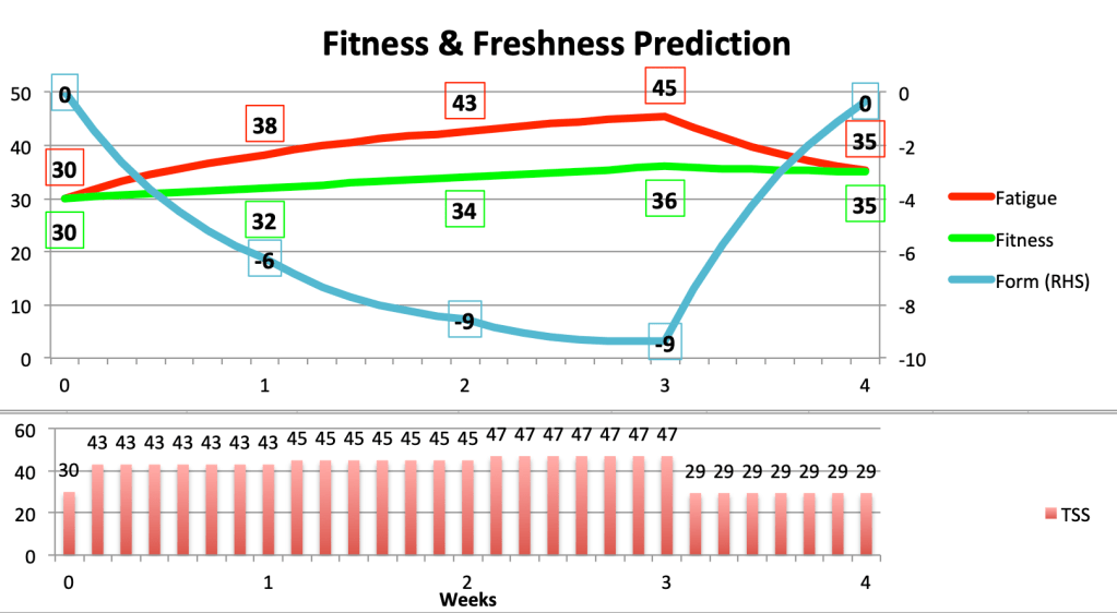
is Fitness or Fatigue on day t and
\lambda = exp(-1/42) \approx 0.976 for Fitness or
\lambda = exp(-1/7) \approx 0.867 for Fatigue

This is why your Fitness falls by about 2.4% and your Fatigue eases by about 13.3% after a rest day. The formula makes it straightforward to predict the impact of a training plan stretching out into the future. It is also possible to determine what Training Load is required to achieve a target level of Fitness improvement of a specific time period.

Ramping up your Fitness

The change in Fitness over the next seven days is called a weekly “ramp”. Aiming for a weekly ramp of 5 would be very ambitious. It turns out that you would need to increase your daily Training Load by 33. That is a substantial extra Training Load of 231 over the next week, particularly because Training Load automatically takes account of a rider’s FTP.

Interestingly, this increase in Training Load is the same, regardless of your starting Fitness. However, stepping up an average Training Load from 30 to 63 per day would require a doubling of work done over the next week, whereas for someone starting at 60, moving up to 93 per day would require a 54% increase in effort for the week.

In both cases, a cyclist would typically require two additional hard training rides, resulting in an accumulation of fatigue, which is picked up by Strava’s Fatigue score. This is a much shorter term moving average of your recent Training Load, over the last week or so. If we assume that you start with a Fatigue score equal to your Fitness score, an increase of 33 in daily Training Load would cause your Fatigue to rise by 21 over the week. If you managed to sustain this over the week, your Form (Fitness minus Fatigue) would fall from zero to -16. Here’s a summary of all the numbers mentioned so far.

Impact of a weekly ramp of 5 on two riders with initial Fitness of 30 and 60

Whilst it might be possible to do this for a week, the regime would be very hard to sustain over a three-week block, particularly because you would be going into the second week with significant accumulated fatigue. Training sessions and race performance tend to be compromised when Form drops below -20. Furthermore, if you have increased your Fitness by 5 over a week, you will need to increase Training Load by another 231 for the following week to continue the same upward trajectory, then increase again for the third week. So we conclude that a weekly ramp of 5 is not sustainable over three weeks. Something of the order of 2 or 3 may be more reasonable.

A steady increase in Fitness

Consider a rider with a Fitness level of 30, who would have a weekly Training Load of around 210 (7 times 30). This might be five weekly commutes and a longer ride on the weekend. A periodised monthly plan could include a ramp of 2, steadily increasing Training Load for three weeks followed by a recovery week of -1, as follows.

Plan of a moderate rider

This gives a net increase in Fitness of 5 over the month. Fatigue has also risen by 5, but since the rider is fitter, Form ends the month at zero, ready to start the next block of training.

To simplify the calculations, I assumed the same Training Load every day in each week. This is unrealistic in practice, because all athletes need a rest day and training needs to mix up the duration and intensity of individual rides. The fine tuning of weekly rides is a subject for another blog.

A tougher training block

A rider engaging in a higher level of training, with a Fitness score of 60, may be able to manage weekly ramps of 3, before the recovery week. The following Training Plan would raise Fitness to 67, with sufficient recovery to bring Form back to positive at the end of the month.

A more ambitious training plan

A general plan

The interesting thing about this analysis is that the outcomes of the plans are independent of a rider’s starting Fitness. This is a consequence of the Markov property. So if we describe the ambitious plan as [3,3,3,-2], a rider will see a Fitness improvement of 7, from whatever initial value prevailed: starting at 30, Fitness would go to 37, while the rider starting at 60 would rise to 67.

Similarly, if Form begins at zero, i.e. the starting values of Fitness and Fatigue are equal, then the [3,3,3,-2] plan will always result in a in a net change of 6 in Fatigue over the four weeks.

In the same way, (assuming initial Form of zero) the moderate plan of [2,2,2,-1] would give any rider a net increase of Fitness and Fatigue of 5.

Use this spreadsheet to experiment.